Category Archives: Shared Articles

Nodal: An ES6 API Server

Sometimes I feel like client-side developers are adopting ES6 faster than server-side developers. I certainly have projects where the client uses ES6 and the Node server code is more ES5, mainly because I don't really want to use a transpiler on the server, although I sometimes do like to use Harmony flags.

Alternatively, I could use io.js. Keith Horwood recently sent in a new module that aims to provide an API server and web framework that takes advantage of ES6 features. It's called Nodal (GitHub: keithwhor/nodal, License: MIT, npm: nodal) and currently runs on io.js.

Nodal includes support for models, controllers, templates, migrations, routing, and query composition. It has a command-line tool for creating RESTful resources, and it's designed to work with PostgreSQL.

The example code makes heavy use of new language features like const and classes. The result is very Rails/Django-like. Here's a snippet of a model class:

module.exports = (function() {  
  'use strict';

  const Nodal = require('nodal');

  class Person extends Nodal.Model {
    __preInitialize__() {}
    __postInitialize__() {}
  }

  Person.prototype.schema = Nodal.my.Schema.models.Person;

  Person.prototype.externalInterface = [
    'id',
    'name',
    'age',
    'created_at'
  ];

  return Person;
})();

It doesn't have the same kind of auto-loading magic that you see in Rails -- notice the Nodal module is loaded explicitly. It still feels like idiomatic JavaScript rather than using ES6 to pretend to be something else.

Nodal doesn't use an external ORM, it actually has its own models backed by any-db-postgres. That means Keith is developing features like model relationships. I've tried to develop my own ORM before, and the ORMs I've used before have been very mixed in terms of quality and consistency between releases, so I don't envy the work he has ahead. However, the idea of a RESTful web framework that takes advantage of ES6 for code organisation and clarity is interesting, so let's see what he does with it!

Generators vs Fibers

Both ES6 generators and node-fibers can be used to block a coroutine while waiting on some I/O without blocking the entire process.

This means that you can wait for an I/O result within your code but still have the performance benefits of the single-threaded, non-blocking I/O model you all know and love.

Both can do this for arbitrarily deep call stacks. The main difference between the capabilities of the two is how explicit the syntax is. It's the classic battle between wanting to be safe while wanting to be flexible.


Generators - Safe, but Annoyingly Explicit

In code that uses generators there is a technique whereby a library will yield continuables or promises and the generator runner will pass in the callback, suspend the generator body, and resume when the callback gets called.

I will use my library, gen-run, in these examples because it's very simple and is the one I know best. There are many others I link to in the gen-run credits.

The Server

We'll start out by writing a simple HTTP server that uses generators to power the request handling logic. It could look something like this.

The Handler

Initially when we write our programs, we often use canned data or otherwise have less I/O to perform to accomplish the given task. In this example, we're using a simple module that returns the result directly.

Now our main app logic can be written. Remember that the server expects us to be in a generator so let's write the logic as a generator.

We want each result to be tagged with the request count as it came into the server. A simple shared variable that gets incremented at the beginning of each request should do the trick.

You can call this with as many concurrent requests as you want. Each will have the correct requestCount because of run-to-finish semantics of JavaScript. Even inside the bodies of generators, arbitrary function calls can't suspend your code.

Modified Handler

Now suppose that down the line, our query function needed to actually do things and perform some I/O.

First we'll change the query function to return a continuable and/or accept a callback. This is a common pattern for many node libraries that need to perform I/O.

We thought ahead and put the body of our handler in a generator to ease the transition, but that function call needs to change. The query function now returns a continuable or expects a callback last. Our handler function can now look like this.

Now we have that big bright yield keyword in there. We can see plainly that our requestCount variable is in danger of a race condition. What happens if a second request comes in while we're still waiting on the query from the first request? They will clobber each other and both requests will be marked as #3, that's what!

Good thing we were forced to change our calling syntax to help us see the danger.

Modified Again

Another transform we could have done is re-write query as a generator itself allowing for deep coroutines with function* at every definition and yield* at every call.

In this case we insert a delegating yield* instead of a plain yield and it works the same as the previous change.

In summary, generators allow for all kinds of nice tricks where you can block on I/O without actually blocking the process, however these require invasive changes to your code (much the same as callbacks act today).

Fibers - Powerful, but Flexible

Long before generators landed in V8 and node.js, Marcel released a library known as node-fibers. This clever little library allows you to use full coroutines in any version of node that the addon compiles against.

I'll repeat the same examples here, but using fibers instead of generators for easy comparison.

The Server

Our server is slightly different because the fiber API is quite different than the gen-run and generator APIs.

We create a fiber for our code to run in. With fibers there is no distinction between generators, iterators, or normal functions. They are all just vanilla functions. Also this means there is no yield or yield*. Only normal function calls.

Also within the body of the fiber, try..catch works just like it does with sync code because the code is blocking within this fiber.

The Handler

We'll start out again with a simple handler. We'll use the same exact query function from before and the same handleRequest except this one is a plain function.

The world is great, everything works and there is no race condition because nobody actually ever suspends the fiber.

The Change

Now again, imagine that some time down the line, the authors of the query function need to perform some I/O to accomplish its task. Well in this case they know they are running inside a fiber. (And even if they didn't know this, they could detect it).

So the only code change required to make query block on I/O is local to the query function.

That's it. The rest of the code will continue to work as before. You test it locally and everything works great. You didn't have to change the signature of any other function that consumed this library.

Then you push this code to production where the server hits a higher concurrency load and people start complaining that their requestCounts aren't always accurate. The problem you discover after many hours of painful debugging is that the query function back in handleRequest that didn't need to be changed syntacticly did change behavior. It suspended the fiber and let other concurrent requests clobber the shared requestCount variable.

Lesson Learned

Next time you complain that adding an async feature to a library causes all consumers of this API to be changed as well, remember that along with that pain is protection. You can't have the protection without the pain.

Both styles of coroutines are powerful with unique strengths and weaknesses.

Safety or flexibility, choose one.

How 3 Modern Tools are Using Flexbox Grids

There are plenty of valuable resources (articles, tutorials, and online tools) discussing the flexbox layout module. Flexbox has gained so much traction that more and more grids and frameworks are supporting this powerful layout feature.

In this article, we’ll examine how 3 tools are incorporating flexbox-based grids and I’ll show you some demos that will illustrate the features.

Note: This article expects that you have some knowledge of flexbox.

Flexbox Grid is a grid system built on top of flexbox. If you’re familiar with Bootstrap, this grid uses the same predefined grid classes and media query breakpoints. The following table summarizes how the grid works:

Screens Viewport Size Container Width Class Prefix
Extra small screens <30em (768px) auto .col-xs-*
Small screens ≥48em (768px) 46rem (736px) .col-sm-*
Medium screens ≥62em (992px) 61rem (976px) .col-md-*
Large screens ≥75em (1200px) 71rem (1136px) .col-lg-*

To get started with Flexbox Grid, you have to install and include the required CSS file (i.e. flexboxgrid.css) in your projects. More information about this process is available on the project’s GitHub page.

Let’s now create a responsive navigation menu based on this grid. Here’s what we’re going to build:

Flexbox grid example

First, we define the ul element as a flex container by assigning the row class to it. Then we use the col-xs-2 class to specify the width of the flex items. This class ensures that the list items will have a maximum width equal to 16.667% for all devices. Finally, we horizontally and vertically center our items by adding the center-xs and middle-xs classes to the flex wrapper.

Below is the required HTML:

<nav>
  <ul class="row center-xs middle-xs">
    <li class="col-xs-2">
      <a href="#">Home</a>
    </li>
    <li class="col-xs-2">
      <a href="#">About</a>
    </li>
    <!-- more list items here... -->
  </ul>
</nav>

And here are some CSS styles to enhance the appearance of our menu:

.row {
  height: 80px;
}

ul a:before  { 
  font-family: FontAwesome;
  font-size: 22px;
}

ul li:nth-child(1) a:before {
  content: 'f015';
}

@media screen and (max-width: 800px) {
  ul a {
    font-size: 0;
  }

  ul a:before {
    font-size: 32px;
  }
}

Note: To keep things simple, I’ve only included some of the rules from the corresponding CSS file.

See the Pen A flexible menu based on the Flexbox Grid framework. by SitePoint (@SitePoint) on CodePen.

At this point we have a new requirement. We have to add our logo to the main menu. The following screenshot shows what we want to create:

Flexbox grid example with logo

To make that work, we’ll add a bit of extra markup.

Here’s the new version of our HTML:

<div class="row center-xs middle-xs">
  <div class="col-sm-2 col-xs-4">
    <h1>
      <a href="#">My Logo</a>
    </h1>
  </div>
  <div class="col-sm-8 col-sm-offset-2 col-xs-12">
    <nav>
      <ul>
        <li class="col-xs">
          <a href="#">Home</a>
        </li>
        <!-- more list items here... -->
      </ul>
    </nav>
  </div>
</div><!-- end of .row ... --> 

Let’s explain the code above:

  • We define a div element as the outer flex wrapper of our logo and menu. We assign different grid classes to the flex items depending on the viewport size. For example, on small devices and up (≥768px) the logo will have a maximum width equal to 16.667%, while the menu will occupy 66.667% of the parent’s width.
  • We choose to move our menu 16.667% to the right by giving it a class of col-sm-offset-2.
  • Finally, notice the col-xs class we set on our list items. If you remember the previous example, we had used the col-xs-2 class. In this case though, we apply the col-xs class because we give items the option to grow and cover the entire parent’s width.

See the Pen A flexible menu, with logo, based on the Flexbox Grid framework. by SitePoint (@SitePoint) on CodePen.

UIkit is a modern front-end framework similar to Bootstrap and Foundation. It comes with a number of different components, which you might find useful depending on your needs. For the purposes of this article, we’ll combine the Flex, Slideshow, and Dotnav components, so as to build a responsive slideshow.

As usual, to use this plugin in your projects, make sure to download and install the required files. Also keep in mind that the additional components aren’t included in the core framework, so if you want to use any of those components, you have to add them to your projects as well.

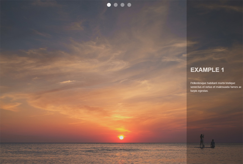
The image below shows what our slideshow will look like:

UIkit flexbox example

To build it, we’ll take advantage of the basic code for the Slideshow component that UIkit provides us:

<div data-uk-slideshow>
  <ul class="uk-slideshow uk-slideshow-fullscreen">
    <li>
      <img src="https://download.unsplash.com/photo-1414446483597-8d8f792bfe39">
      <div class="uk-overlay-panel uk-overlay-background uk-overlay-fade">
        <div class="caption"> 
          <h3>Example 1</h3>
          <!-- more content here -->
        </div>
      </div>
    </li>
    <!-- more list items here --->
  </ul><!-- end of slideshows list --->
  <ul class="uk-dotnav uk-dotnav-contrast uk-position-top uk-flex-center">
    <li data-uk-slideshow-item="0">
      <a href="#"></a>
    </li>
    <li data-uk-slideshow-item="1">
      <a href="#"></a>
    </li>
    <li data-uk-slideshow-item="2">
      <a href="#"></a>
    </li>
    <li data-uk-slideshow-item="3">
      <a href="#"></a>
    </li>
  </ul><!-- end of dotnavs list --->
</div>

Notice the uk-flex-center class that we applied to the second ul element. This horizontally centers the slideshow navigation. In addition, we can modify the flex behavior by removing this class and adding another one (e.g. the uk-flex-column class).

See the Pen UIkit slideshow with flexbox by SitePoint (@SitePoint) on CodePen.

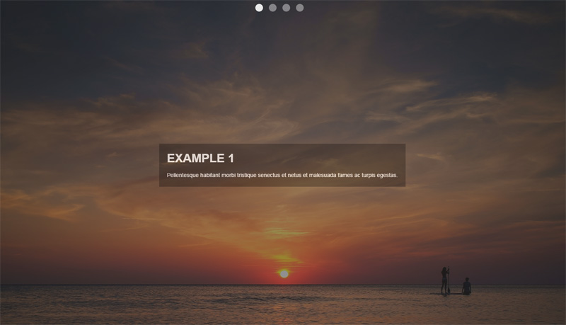
At this point, we’ll use the power of flexbox to modify the previous version of our slideshow. In fact, we’ll change the position of the div.caption element. As you can see in the screenshot below, the goal is to horizontally and vertically center it:

UIkit flexbox example 2

To achieve this, all we have to do is assign some additional helper classes to the immediate parent (flex wrapper) of the div.caption element (flex item). Here’s the HTML that we have to update:

<div class="uk-overlay-panel uk-overlay-background uk-overlay-fade 
            uk-flex uk-flex-center uk-flex-middle">
  <div class="caption">
    <h3>UIkit Framework</h3>
    <!-- more content here -->
  </div>
</div>

See the Pen UIkit slideshow with flexbox and alternate caption layout. by SitePoint (@SitePoint) on CodePen.

Brian Franco has developed a set of useful Sass mixins that we can use to build flexible layouts. In order to work with them, you have to grab a copy of the required SCSS file (the flexbox.scss partial) from the GitHub repo then incorporate it in your SCSS project.

At this point, let’s see those mixins in action by trying to replicate the layout of the following screenshot:

Flexbox mixin example

To do this, we start by setting the section element as our flex container and we lay out the flex items vertically (as columns). Next, each of the columns receives a different value for the justify-content property. The last step is to take advantage of CSS pseudo-elements in order to create some extra “flex items”.

Here’s our HTML:

<section>
  <div class="box box1" data-content="Box2">
    <h3>Box1</h3>
  </div>
  <div class="box box2" data-content="Box4">
    <h3>Box3</h3>
  </div>
  <div class="box box3">
    <h3>Box5</h3>
  </div>
</section>

And the SCSS styles:

section {
  @include flexbox;
  @include flex-direction(column);

  .box {
    width: 20%;
    height: 100px;
    position: relative;

    &:after {
      display: block;
      position: absolute;
      top: 50%;
      right: -100%;
      width: 100%;
      height: 100%;
    }
  }

  .box1 { 
    @include align-self(flex-start);

    &:after {
      content: attr(data-content);
    }
  }

  .box2 {  
    @include align-self(center);

    &:after {
      content: attr(data-content);
    }
  }

  .box3 { 
    @include align-self(flex-end);
  }

  @media screen and (max-width: 500px) {
    .box {
      width: 100%;
    }

    &:after {
      top: 100%;
      right: 0;
    }
  }

} 

Note: To keep things simple, I’ve only included some of the rules from the corresponding SCSS file and I’ve omitted the compiled CSS.

See the Pen A flexbox layout with Brian Franco’s sass-flex-mixin by SitePoint (@SitePoint) on CodePen.

More Flexy Grids

Beyond the three tools that we analyzed above, there are other flexbox-based grids and frameworks, some of which are shown below:

Conclusion

I hope this summary has helped you see how some modern tools are using flexbox. As a next step, I recommend experimenting with the following exercises:

  • Incorporate a flexbox grid into your favorite framework, if it doesn’t support the flexbox layout method.
  • Make the examples presented above more fancy by adding CSS transitions, CSS animations or by modifying the flex behavior.

If you’ve used any modern frameworks that incorporate flexbox, let us know in the comments.

Forget UX. How to Focus on Conversion Centered Design

Michael Coghlan:  Fringe Box Office

Photo: Michael Coghlan

When you start a design project – what do you aim for? What principles do you go by? I’m quite curious to know what goes on in your head.

Over the last few weeks, I’ve seen dozens of new business owners launch their website. This was in an online business course that I was part of. Some of these sites were done by the owners themselves, and a larger number done by professionals who charged a bomb.

However, what stood out was the common thread running through those sites. These businesses were all focused on, or at least trying to focus on, their end user. They wanted to please, to provide value, and ultimately seduce potential customers. They put in the research and came up with visually appealing websites, which they thought would provide a great user experience.

Then they waited with bated breath for the subscribers, and the sales.

And kept waiting.

While their marketing efforts kept the traffic coming in, viewers were just not signing up, or buying. It was heart breaking.

No matter how beautiful your design, or how great your user experience, if visitors don’t sign up, or buy, you might as well not have a website at all. A site that dies with happy users but no revenue, still dies.

Of course, if you’re lavishly funded by VCs and not required to turn a profit in the short term, you can afford to focus entirely on UX and leave revenue to work itself out later (shout out to Twitter).

But the reality is that most of us don’t have that luxury.

What if, instead of relying on a digital marketer to come in later and fix this situation, we started weaving in the elements of conversions into our designs? Along with the visual appeal and user experience, perhaps it’s time designers shifted focus – or at least became conscious of – Conversion Centric Design (CCD).

With Conversion Centric Design the focus is on creating experiences that drive visitors towards a specific business goal. Persuasive design and psychology principles are used to actively drive visitors into the sales funnel – rather than just creating a pretty site and hoping people sign up.

Conversion Centric Design has so far, been the domain of internet marketers, looking to increase conversions on landing pages and sales pages. But there’s no reason the same principles can’t be used while designing the entire website.

Let me walk you through some of the design elements of conversion centric design that you can easily incorporate in your designs. And while we’re at it, let’s take a look at some examples as well.

Design Elements

1. Encapsulation

Encapsulation is a technique where you create a frame around a feature or focus area, to ‘hijack’ your visitors gaze. By doing this, you can subtly ensure that certain pieces of information are highlighted and get the attention they deserve. Encapsulation can be done using images, graphics, or just simple frames around the element you want to highlight.

It works particularly well with Call-To-Actions of all types, as well as testimonials, or data points that you want to share on your site.

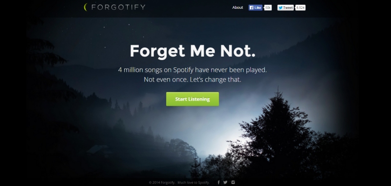
For example, take a look at Forgotify’s home page. The simple play of light in the background frames their CTA in an almost mesmerizing manner.

Forgotify

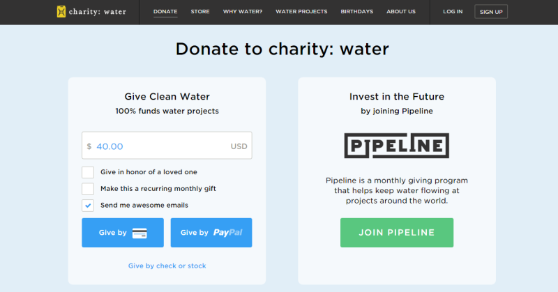
CharityWater also uses encapsulation in a more subtle way. The slightly paler background color on their CTA versus the rest of the page, helps frame the CTA clearly and draw visitors to it.

CharityWater: http://charitywater.com

2. Contrast and Color

Color and contrast have long been used in design aesthetics to evoke certain emotions. This is about using color contrast to subtly nudge and persuade viewers into taking a desired action.

That action could be anything – signing up, buying, or even just clicking through to the next page. Notice how Forgotify’s simple “Start Listening” in green pops out against the dark background. You just have to click it.

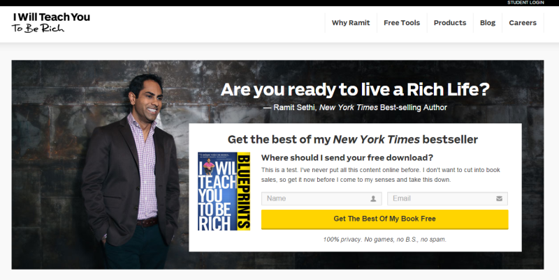
As another example, take a look at the IWT page – there’s no chance visitors can miss that bright yellow CTA.

IWT: http://iwillteachyoutoberich.com

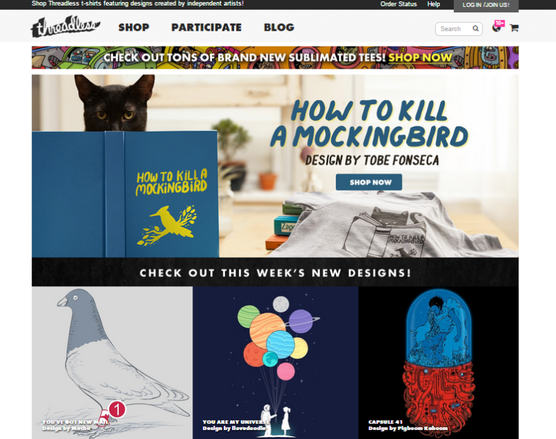
In contrast, take Threadless. They just got the color contrast part all wrong! Multiple blue images and graphics completely drown out the small blue “Shop Now” button. Can you find it in the image? Instead, the colorful planets and the red half of the capsule jostle for the viewers attention.

Threadless: https://www.threadless.com/

A smart move is using buttons or contrasts that also generate the desired psychological impact.

3. Directional Cues

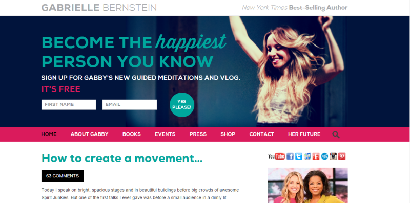
Directional Cues are visual indicators, subtle or otherwise, that you use to draw attention to your focal point. Subtle inclusions include using a scenery that has a salient pointer or picture of a person looking at the desired focal point. Using arrows, is a clear, unambiguous way to draw attention. In the screenshot below, follow Gabrielle Bernstein's line of sight – it leads directly to the optin on her homepage. It’s the perfect header image – leading directly to sign ups for her newsletter.

Gabby: http://gabbyb.tv/

4. White Spaces

Remember the trend when everyone tried to use up every possible pixel of the page’s real estate? Google’s simple home page was considered revolutionary in those days. They wanted their home page to do just one thing – help people search the internet.

Just one box. Nothing else on the page. No menu. No About page. Nothing else. That simple text box right in the middle of a blank page has helped Google make billions. Do I need to say any more about the power of white spaces in conversion design?

Google

Psychology Elements

5. Urgency and Scarcity

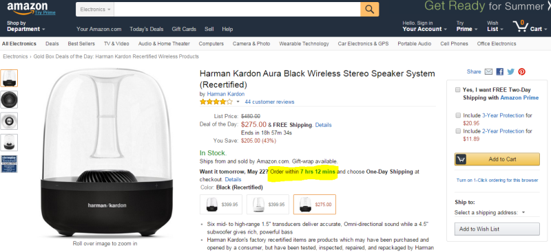
Decision Theory shows people are more averse to losing something or missing out on it, as compared to acquiring something. It’s called Loss Aversion and has been widely used to prompt visitors to signing up or purchasing something from the website. Amazon uses this technique extensively creating a sense of urgency with their “Want it tomorrow? Order within X hours, Y minutes”.

Amazon

Back on the IWT website, Ramit Sethi doesn't use a definite timeline. Instead he creates that sense of urgency by saying "get it now before I change my mind and take this down". Great example of how simple copy writing can be used to create scarcity.

6. Try before you buy

Another widely used conversion technique is the “Try Before You Buy”. Street vendors and shops have been using this technique for centuries, but it’s only now catching up in the online world.

As humans, we hate uncertainty – it's in our DNA. Especially the uncertainty that comes from impersonal online interactions. When buying a book, or shoes, or clothes or software online, the customer can’t pick it up, try it out, feel it, smell it. Offering visitors a free sampling of your software, preview of your book, or a free consultation session serves to give them a taste of what to expect.

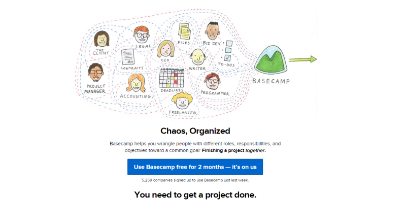
Basecamp has one of the most generous trial offers – for a whole two months. Take a look back at the screenshot of the IWT page – Ramit Sethi offers a free download of the best content from his bestselling book. This gives visitors a safe, risk-free, way to experience the product/book with ample time to make a decision to buy the product.

BaseCamp: https://basecamp.com/

7. Social Proof

People like to belong. They like to be part of a group and will often conform to group decisions and choices, even if they there is an element of doubt.

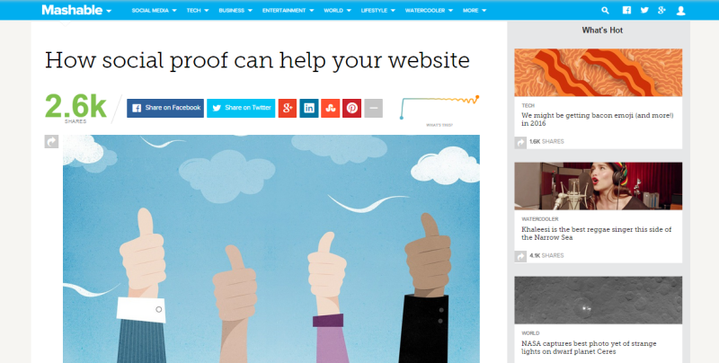
Social proof can be in many forms – endorsements, case studies, reviews, user generated content and even just numbers (of how many people like/use/shared) your content. That’s why many websites today display testimonials and shares up front. Mashable for example, goes a step further to display the ‘velocity’ of their shares – the rate at which people around the globe are sharing their content.

Mashable: http://mashable.com/

Of course, make sure you’re using it right. Highlighting that you have 0 shares, or using the wrong kind of testimonials, can actually backfire.

Summary

I hope this short walk through the design and psychology elements of conversion centric design helped pique your interest. You can get a better understanding of conversion centric design with this free eBook from Unbounce. It all comes down to focusing your design efforts toward specific business results,instead of just putting together a visually appealing site.

Would love to hear your take on this. Do you incorporate conversion principles into their design process? Or do you believe marketing is best left to the internet marketers?

Share your thoughts with us in the comments below.

حافظه‌ی آب

دیدن روی تو در خویش ز من خواب گرفت / آه از آیینه که تصویر تو را قاب گرفت

خواستم نوح شوم، موج غمت غرقم کرد / کشتی‌ام را شب طوفانی گرداب گرفت

در قنوتم ز خدا «عقل» طلب می‌کردم / «عشق» اما خبر از گوشه‌ی محراب گرفت

نتوانست فراموش کند مستی را / هر که از دست تو یک قطره می ناب گرفت

کی به انداختن سنگ پیاپی در آب / ماه را می‌شود از حافظه‌ی آب گرفت


شعر از: فاضل نظری

همکاری مجدد سیاوش و فریدون علیخانی؟!

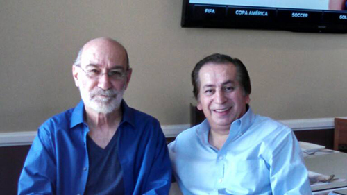
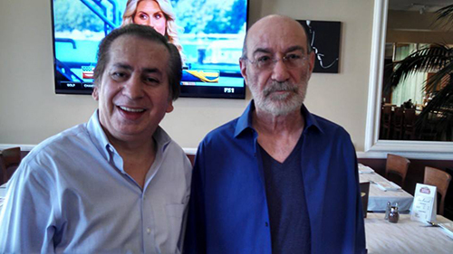
دوستان همونطور که در جریانید چند روز پیش تولد استاد بود و در جریان این تولد مهمون ویژه ای هم حضور داشته. این شخص کسی نبوده جز فریدون علیخانی شاعر آهنگ گِله از آلبوم قاب شیشه ای. فریدون علیخانی علاوه بر قرار دادن دو عکس زیر در ادامه نوشته:
"روزی که سیاوش هفتاد سالگی خودش را جشن میگیرد . روز زیبایی بود. من و او کار جدیدی در دست تهیه داریم. آهنگ زیبایی روی ترانه ای که چندی پیش به او داده بودم."
برای دیدن تصویر در سایز اصلی، بر روی عکس کلیک کنید

برای دیدن تصویر در سایز اصلی، بر روی عکس کلیک کنید

لینک‌های شاد آخرین دوشنبه خرداد ۱۳۹۴

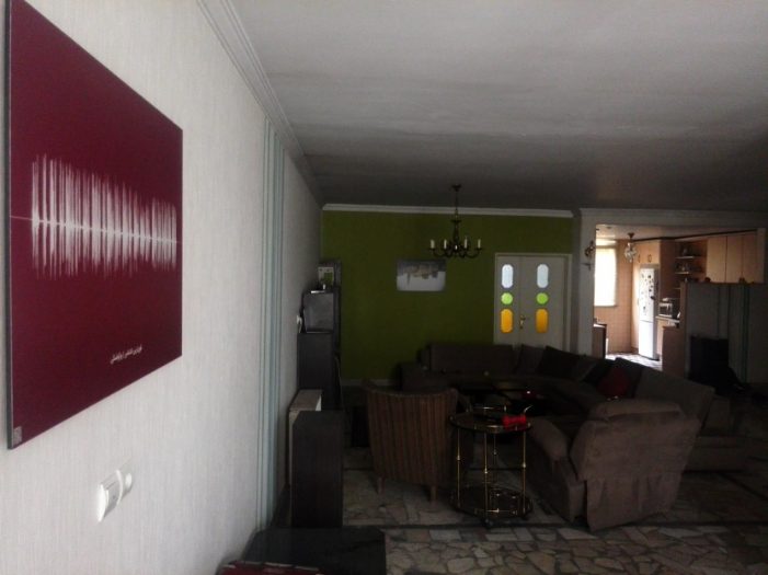
تابلوی خونه جادی از صداگرافی

  • گروهی از بچه‌های لاراول کار هم یک گردهمایی دو هفته یکبار دارن که گاهی هم هفته‌ای یکی می شه. اگر لاراول دوست دارین به سایت لاراتاکز یا توییتر لاراول کارها سر بزنین و اطلاعات بیشتری بگیرین.
  • هفته نامه طراحی وب فارسی هر پنجشنبه بهترین لینک‌های فارسی حوزه طراحی وب رو جمع‌آوری و منتشر می کنه. یک کار خوب که یک نقطه شروع خوب می‌سازه برای هر کسی که علاقمند به طراحی وب است. جالبیش هم اینه که کل پروژه روی گیت هاب است. اطلاعات بیشتر در مورد هفته نامه طراحی وب فارسی

  • بنیاد دانش آزاد هم چیزیه که باید در موردش بدونیم و اگر به حوزه مون می خوره، باهاش همکاری کنیم. توی ویکی بنیاد دانش آزاد در مورد کارهاشون بیشتر توضیح داده شده و چند سالی هست که مشغولن و محتوای بسیار خوبی هم دارن.

  • اگر دنبال اخبار و رویدادهای تکنولوژی هوشمند و پوشیدنی و سیستم‌عامل‌های موبایل و فناور‌ی‌های جدید هستین یک سایت جدید هم براتون دارم؛ تکنولوژی + تاچ = تکنوتاچ. از اسمشون معلومه که ایده‌های جالبی دارن!

« ایـنـکـو » جایست که آدم‌ها با هم لحظاتشان را به اشتراک می‌گذارند زیرا ما مدعی هستیم که می‌توانیم لحظات ناب را با هم شریک شویم. به طور مثال من تا به حال قلعه‌الموت نرفتم و خوشحال می‌شوم قبل از سفر، نظرات کاربران نزدیک آن منطقه را بدانم؛ یا همایشی که امروز در آن حضور دارم، چه صحبتی در جریان است؟ حالا می‌توانیم اطلاعات مورد نظرمان را به شکلی متفاوت بدست آوریم، به طوری که لازم نباشد متنی را در پست‌ها جستجو کنیم، زیرا ممکن است زبان اسپانیایی بلد نباشیم، ولی دوست داریم بدانیم آیا کسی در اسپانیا تصاویری از مناظر شهر را به اشتراک گذاشته؟ در « ایـنـکـو » این امکان را فراهم آوردیم که با انتخاب موقعیتی در نقشه، پست‌های آن نزدیکی نمایش داده شود و البته برای استفاده از « ایـنـکـو » هیچ اجباری در ارسال مکان جغرافیایی شما نیست.

  • بین این همه سایت‌های تکنولوژی، دیدن زمانا هم جذابیت‌های خودش رو داره. اولا که سعی می کنه در مقابل ترجمه دائمی مطالب مربوط به گجت در خیلی از سایت‌های دیگه، مطالب بلند مدت تری بنویسه و بعد اینکه روی سرویس بلاگ.آی.آر نوشته می شه تا نشون بده که سوارکاری خوب فقط به اسب خوب داشتن نیست.
  • سایت خبری گود نیوز هم حدود یکسالی هست که فعاله و حالا نسخه دوم آزمایشی‌اش مجهز شده به یک ریدر و خبرخوان عمومی و یه سری خدمات جانبی هم مثل فوتبال و ارز و مسکوکات و آب و هوا. از برخی خدماتش می تونین استفاده کنین و بخشی از قسمت‌ها هم دعوت نامه ای است که امیدوارم اگر می خواینش،‌ گرفتنش سخت نباشه.

و …

بازار کار

‌ شرکت کامپلی‌تل می گه دنبال آدم‌هایی است که بخوان چالش‌های جدید حل کنن، بتونن با گوگل گلیمشون رو از آب بیرون بکشن و دوست دارن تو تیم فعال پروژه‌های اپلیکیشن و سرویس‌های موبایلی باشن. کامپلی‌تلکام دنبال متخصص UX، UI و چند توسعه دهنده که تخصصشون جاوا و اندروید باشه میگرده، اگر در مورد نحوه کار کردن سرور و سرویس های مختلف لینوکسی اطلاعاتی داشته باشید خیلی بهتره. رزومه خودتون رو به job@completelecom.com ارسال کنید.

نالینک‌ها


سینرژی یعنی اضافه شدن دو چیز و تولید محصولی بزرگتر از جمع اون دو چیز. سینرژی یعنی اگر من رسانه ای دارم و مخاطبی، اونو با شما به اشتراک بذارم تا همه نفع ببرن. اگر مطلبی دارین که فکر می کنین برای معرفی در آخرین دوشنبه‌ تیرماه مناسبه،‌ برام بفرستین تا اینترنت بهتری برای فارسی‌زبان‌ها بسازیم.

اشتراک‌گذاری:

نگاهی نو به یک نظریه قدیمی، گشتالت‌ها در رابط کاربری

Gestalt---Logo

تا کنون به این موضوع فکر کرده‌اید که کلمات چطور در کنار هم یک متن معنی‌دار را شکل می‌دهند؟ در متون نگارشی برای کنار هم قرار گرفتن واژه‌ها قوانینی وجود دارد که آنها را به صورت‌های معنادار تبدیل می‌کند و یک متن با‌معنی را با رعایت نگارش ادبی می‌سازد. پیام‌های بصری‌ای که یک رابط کاربری به مغز ما می‌رساند نیز از همین روال پیروی می‌کنند به شکل زیر توجه کنید.

Untitled-4

نظریه گشتالت

داستان از جایی شروع شد که یک روانشناس آلمانی در هنگام سفر خود با قطار به این می‌اندیشید که اگر دو نور متفاوت به صورت هماهنگ روشن و خاموش شوند به ببینده این حس را القا می‌کنند که این تنها یک نور است که در حال چشمک زدن است. درست مانند انیمیشنی که تصاویر آن پشت سر هم از جلوی چشمانمان عبور می‌کنند و مغز انسان قادر نیست این تصاویر را به صورت تنها درک کند. این فکر جرقه‌ایی بود تا این روانشانس آلمانی به کمک دوستان خود در قرن بیستم بتواند نظریه گشتالت ها را که مشتکل از قوانینی مجزا بود را به عنوان مکتب گشتالت پایه گذاری کنند.
طبق این نظریه ما دنیا را در کل‌های معنی‌دار تجربه می‌کنیم و محرک‌های جداگانه را نمی‌بینیم و هرآنچه می‌بینیم محرک‌های ترکیب یافته در سازمان‌هایی است که برای ما معنی دارند.

این نظریه قوانینی را ارائه می‌دهد که با به کارگیری برخی از آن‌ها در طراحی رابط کاربری که بسیار ابتدایی هستند می‌توان یک طرح ساده و روان را پیاده کرد.

  • قانون همجواری (Law of Proximity)
  • قانون شباهت (Law of Similarity)
  • قانون تقارن (Law of Symmetry)
  • قانون نقطه کانونی (Law of Focal Point)
  • قانون سادگی (Law of Simplicity)
  • قانون تصویر و زمینه (Law of Figure and Ground)

قانون همجواری (Proximity)

اشیاء نزدیک به هم در یک گروه به نظر می‌آیند.

proximity

در طراحی اسکچ به دلیل سادگی طرح فقط خطوط ساده هستند که طرح کلی سایت را مشخص می‌کنند. ولی به هنگام پیاده سازی طرح در مرحله گرافیکی با ورود تصاویر، رنگ‌ها و …، وجود همین خطوط با گرفتن استایل‌های زیبا باعث بالا رفتن نویز تصویری طرح می‌شوند، در واقع ما می‌خواهیم با اعمال این خطوط به ببننده کمک کنیم تا بتواند بخش‌های مختلف را به راحتی از هم تشخیص دهد ولی بیشتر مواقع موفق نمی‌شویم!
به تصویر بالا نگاه کنید بدون هیچ المان اضافی‌ای توانستیم با نزدیک کردن دایره‌ها ستون‌ها را به صورت عمودی و صعودی مرتب کنیم، دقیقا با استفاده از همین اصل در طراحی رابط کاربری می‌توانیم از اعمال اجزای اضافی در طرح جلوگیری کنیم.
به مثال زیر توجه کنید :

Gestalt---Page-Screend

قانون شباهت (Similarity)

اشیایی با مشخصه‌های شبیه به هم در یک گروه به نظر می‌آیند.

similarity

شباهت یکی از عواملی است که به آدرس‌دهی ذهنی کاربران بسیار کمک می‌کند. در طراحی رابط کاربری با لحاظ شباهت بین قسمت‌های مختلف سایت می‌توانیم پیچیدگی طرح را به حداقل برسانیم. شباهت را می‌توانیم با مشخه‌های بصری مانند رنگ، اندازه، پترن و شکل یا به وسیله ادغادم چند مشخصه ایجاد کنیم.

از کاربردهای مهم این قانون می‌تواند به طراحی ایکون‌ها با مشخصه‌های همسان اشاره کرد. همچنین با لحاظ این قانون می‌توانیم فرم‌های خواناتری را نیز ایجاد کنیم.

Gestalt---Similarity

قانون تقارن (Symmetry)

اشکال متقارن کامل به نظر می‌آیند، اشکال نامتقارن ناقص.

symmetry

این قانون به این حقیقت اشاره دارد که اشکال متقارن پایداری، ثبات و سازمان یافته به نظر می‌رسند. اشکال نامتقارن بر خلاف اشکال متقارن حاوی پیام‌های منفی مانند نقص، اشتباه و یا فقدان بالانس را القا می‌کنند.
یکی از ساده‌ترین راه‌های پیاده‌سازی رابط‌های کاربری متقارن طراحی برپایه گرید (Grid-Based Design) در لایه‌بندی است. سیستم‌های گرید از تعدادی ستون هم اندازه تشکلی شدند. و سیستم‌های ۱۲ ستون یکی از رایج‌ترین حالت این سیستم‌ها هستند. این به دلیل است که عدد ۱۲ بیشترین بخش‌پذیری را نسبت به اعداد کمتر از خود دارد (۱ ۲ ۳ ۴ ۶ ۱۲) پیروی از این روال ناخواده باعث ایجاد رابط‌های کاربری متقارن می‌شود.

مثال

Gestalt---Page-Screen

قانون نقطه کانونی (Focal Point)

متمایزترین نقطه توجه را به خود جلب می‌کند

focal_point

گروهی از محققان دانشگاه علوم و تکنولوژی میزوی (MST) آمریکا در سال ۲۰۱۲ آزمایش Eye-tracking را بر روی وب‌سایت‌های مختلف انجام داده‌اند که نتایج تحقیقات آنها نشان داد تاثیر اولیه (First Impression) سایت‌ها بر روی یک کاربر در کمتر از دو دهم ثانیه رخ می‌دهد؛ یعنی زمانی معادل یک پلک زدن! بعد از آن کاربر زمانی حدود ۲٫۶ ثانیه را صرف اسکن کلی صفحه و بعد از گذشت این زمان بر یک قسمت مهم سایت تمرکز می‌کند. شما اگر حساب شده طراحی کرده باشید زمانی حدود ۳ ثانیه خواهید داشت که کاربر خود را متقاعد کنید که سایت شما ارزش دیدن را دارد.

قانون سادگی (Simplicity)

المان‌ها و اشیا به ساده‌ترین شکل ممکن درک می‌شوند.

simplicity

سادگی؛ معانی زیادی نسبت به آن تعبیر می‌شود مانند حذف‌کردن، دسته‌بندی کردن و … ولی مهم نیست دقیقا چه کار می‌کنید تا به سادگی برسید. به تصویر بالا نگاه کنید چه می‌بینید؟ یک دایره یا مجموعه دایره‌هایی که بر روی یک محور بسته؟ نکته مهم دقیقا همین‌جاست که یک طراح رابط کاربری چیدمان اجزا را طوری در صفحه قرار دهد تا در ساده‌ترین حالت خود به نظر بیایند و پیچیدگی بصری را به حداقل برساند.

جان مائدا در کتابی به نام Law of Simplicity ده قانون را برای ایجاد سادگی شرح داده است:

  • کاهش : ساده‌ترین راه سادگی کاهش اجزا است.
  • دسته‌بندی : دسته‌بندی باعث می‌شود که سیستم از اجزای کمتری به نظر برسد.
  • زمان : هر چه زمان دستیابی کمتر شود سیستم ساده‌تر می‌شود.
  • آموزش : یادگرفتن هر سیستم پیچیده‌ای استفاده از آن را آسان می‌کند.
  • تفاوت : سادگی در مقابل پیچیدگی معنا پیدا می‌کند.
  • زمینه: محتوای موجود در حاشیه سادگی قطعا در راستای متن سادگی به ارائه محتوا کمک می‌کند.
  • احساسات : ایجاد احساسات به وسیله رنگ‌ها، تصاویر موثرتر از متن‌های ساده است.
  • اعتماد : کاربردپذیری عامل سادگی و ارمغان آور اعتماد است.
  • شکست : تلاش برای ساده‌سازی همیشه موفقیت آمیز نیست ولی کشف جدیدی است برای ساده‌سازی‌های آینده.
  • تنها یکی: حذف اطلاعات بدیهی و قابل پیشبینی و اضافه کردن اطلاعات معنادار.

قانون تصویر و زمینه (Figure and Ground)

ذهن انسان به دنبال درک تصویر اصلی از پس‌زمینه است.

figure_and_ground

تشخیص ارتباط بین تصویر و زمینه آن اولین و مهترین مرحله‌ای است که انسان به هنگام مشاهده در مغز خود انجام می‌دهد. تصاویر وقتی جلو چشمانمان ظاهر می‌شوند باید تشخیص دهیم که کدام یک از اجزا تصویر Figure؛ یعنی قسمت‌هایی که باید بیشترین توجه به آن جلب شود است و کدام اجزا زمینه هسستند؛ یعنی قسمت‌هایی که از اهمیت پایینی برخوردار هستند و محتوایی برای ارائه ندارند.
در طراحی اجزا در رابط کاربری باید توجه داشته باشیم که ببیندگان نیز مانند ما از اهمیت اجزا در طرح آگاه هستند یا خیر؟ با در نظر گرفتن این قانون می‌توانیم زمان پردازش تصاویر را در ذهن کاربرمان به حداقل برسانیم و اشتباهات و سردرگمی‌های کاربر را به حداقل برسانیم.

مثال:
زمان پردازش اسکچ و نمونه پایانی یک سایت را در نظر بگیرید. در نمونه پایانی طراح با استفاده از رنگ‌ها و کانتراست‌ها می‌تواند زمان پردازش طرح را به حداقل برساند.

Gestalt---Figure-Ground

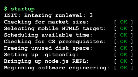
دوره رایگان مهندسی استارتاپ دانشگاه استنفورد

startupeng

انتقادات زیادی به شکل فعلی استارتاپ در ایران و مفهوم و کارکردها و خروجی‌هاش هست. می‌شه پرسید کیا تا حالا موفق بودن و از کجا اومدن، می شه پرسید نیازمندی‌های زیرساختی حضور استارتاپ‌ها چیه و آیا اونها رو داریم و می شه سراغ این جنبه رفت که اصولا مفهوم استارتاپ حاصل کدوم مرحله از بلوغ صنعت نرم‌افزار است و آیا ما مراحل قبلی رو طی کرده‌ایم که بتونیم تمرکز رو روی استارتاپ‌ها بذاریم یا نه. اما خب امسال سال بودجه‌های میلیاردی برای شرکت‌های دانش‌بنیان و استارتاپ است و مطمئنا بیشتر از سال‌های قبل در اطرافمون استارتاپ خواهیم دید. بد هم نیست چون به هرحال چیزیه که جاش خالیه و اگر اینجا دوست داره سریع رشد کنه،‌ بهتر از اینه که اینجا هم سریع رشد نکنه (:

حالا تو این شرایط یک چیز خوب داریم: دوره رایگان کورسرا از دانشگاه استنفورد در مورد مهندسی استارتاپ. اگر اهل استارتاپ و اینها باشین یا دوست داشته باشین شرکت خودتون رو پایه بذارین، این دروس بدون شک هیجان انگیزن:

  • مقدمه
  • ابزارها: ویرچوال ماشین‌ها، IAAS/PAAS، خط فرمان یونیکسی،‌ ادیتورها،‌ DCVS
  • فرانت اند: اچ تی ام ال، سی اس اس، جاوااسکریپت، وایرفریم، تحقیق بازار
  • بک اند: SSJS، دیتابیس‌ها، فریم‌ورک‌ها، دیتا پایپ‌لاین‌ها
  • ای پی آی‌ها: تمپلیت کلاینت ساید، اچ تی تی پی، SOA/REST/JSON، API as BizDev

و البته بخش مهمی که حداقل برای من دوره رو بسیار جذاب کرده:

  • تاسیس شرکت: شروع، ساخت و جمع‌آوری سرمایه
  • رشد دادن شرکت: پیش بردن، حسابداری و …

منطقا برای شرکت لازمه علاوه بر انگلیسی و نظم و جدیت، کمی در مورد برنامه نویسی و پایه‌های HTML و CSS‌ و جاوااسکریپت بدونین و صفحه مهندسی استارتاپ دانشگاه استنفورد در کورسرا چند کتاب پیشنهادی هم معرفی کرده و البته باید بتونین توی وب سرویس‌های آمازون هم یک اکانت مجانی باز کنین.

اشتراک‌گذاری:

گیرنده مُرده است

  • گوشه‌متر

  • عالی
  • 0/5 میانگین رأی شما

  • 0 شما هم رأی‌ و نظر دهید

  • Family Life
  • از نگاه:

  • چکیده:

  • خانواده من دومین کتاب آکیل شارما درباره یک خانواده هندی است که به امید زندگی بهتر به آمریکا مهاجرت می‌کنند. اما با به کما رفتن یکی از فرزندان‌شان در اثر یک حادثه زندگی آنها تغییر می‌کند. راوی داستان، آجی هشت ساله است که هر روز با برادر بزرگ‌ترش در خیابان‌‌های دهلی کریکت بازی می‌کرد و حالا او را روی تخت در بی‌هوشی می‌بیند.

گاهی که خیلی شاد و خوشحال هستید و هیچ دغدغه‌ای خیال‌تان را ناآرام نمی‌کند، احتمالا ناگهان به فکرتان می‌رسد، شاید قرار است اتفاقی بیفتد… شاید این خوشی موقتی است، شاید قرار است اتفاق بدی بیفتد و شاید و شاید و …

آکیل شارما نویسنده هندی _ آمریکایی از این دسته آدم‌هاست. وقتی جایزه ادبی فولیو را برای کتاب «خانواده من» گرفت و از او پرسیدند چه akhil_sharma
احساسی داشتی؟ گفت اولین احساسی که سراغش آمده شرم بوده: «می‌خواستم گریه کنم، انگار کار بدی کرده‌ام.»

اخیرا در مصاحبه‌ای گفته دلیل امتناعش از «شادی و شاد بودن» نوعی انورکسیا است که تصمیم می‌گیری چیزی نخوری.

در این حالت تصمیم می‌گیری شاد نباشی: «من ترجیح می‌دهم در حالت گرسنگی باقی بمانم، چون آن وضعیت را می‌شناسم و برای من راحت‌تر است.»

کتاب اول او جایزه ادبی پن/فالکنر را برد و بیشتر داستان‌های کوتاهش هم در مجله نیویورکر چاپ شده‌اند.

«خانواده من» دومین کتاب او در باره یک خانواده هندی است که به آمریکا مهاجرت می‌کنند. دلیلش امید به زندگی بهتر است

آجی، راوی داستان هشت سال دارد و هر روز با بیرجو برادرش که .چهار سال از او بزرگ‌تر است در خیابان‌های دهلی کریکت بازی می‌کند

پدر آنها یک سال است که به آمریکا رفته تا شرایط بردن خانواده را فراهم کند. تا این که برایشان بلیت می‌فرستد.

تصویرسازی: ین ونگ برای اسلیت

زندگی در آمریکا، زندگی در دنیای ناآشنایی است و تطبیق دادن شرایطش با زندگی که در هند داشتند، برای اعضای خانواده سخت است.

امید پدر به بیرجو است که دانش‌آموز موفقی است.

برادر بزرگ‌تر موفق می‌شود که بورس تحصیلی یک دبیرستان معروف را بگیرد، اما پیش از شروع سال تحصیلی در شیرجه‌ای به کف استخر، می‌خورد و دچار آسیب مغزی می‌شود و به کمایی طولانی مدت می‌رود.

با کمای او امیدهای خانواده و رویای زندگی آمریکایی هم به باد می‌رود.

داستان این کما و این که چطور از او مراقبت می‌کنند، از بین رفتن روابط خانوادگی و دعواهای پدر و مادر و حجم تنهایی و فشاری که به آجی هشت ساله وارد می‌شود، گاهی اوقات بیش از حد تصور است.

روابط آجی با پدر و مادرش و برادر در کما، خواننده را راحت نمی‌گذارد. پدر الکلی است، مادر دست به هر کاری می‌زند تا شاید پسرش به هوش آید و در شرایط کسی سراغ پسر کوچک خانواده نمی‌رود

آجی گاهی اوقات فکر می‌کند اگر برادرش بمیرد، او تنها فرزند خانواده می‌شود؛ گاهی خوشحال از این فکر و بیشتر مواقع از چنین فکری شرمسار. او با ‘خدا’ وارد مکالمه می‌شود. خدای او بیشتر شبیه سوپر من است تا کریشنا.

کتاب احساساتی نیست. نثر ساده، روان و راحتی دارد. آجی کوچک، راوی قصه‌ای است که گاهی بیش از حد دردناک می‌شود. گاهی نیز خنده‌دار می‌شود اما خندیدن وسط آن همه تلخی احساس عذاب وجدان به خواننده می‌دهد.

تیتر: از شعر عباس صفاری

Building a Native App with Javascript Using Nativescript

There are many options available for utilizing HTML, CSS and JavaScript to create cross platform applications and I have covered many of them before. In this article I will look at NativeScript from Telerik that claims to be easier to create for cross platform apps than many existing options.

From their official documentation.

NativeScript enables developers to build native apps for iOS, Android and Windows Universal while sharing the application code across the platforms. When building the application UI, developers use our libraries, which abstract the differences between the native platforms.

Creating an image search flicker app

In this tutorial we will create a simple app that searches for images on flickr and displays the results. We will make use of the flicker developer API to search images.

Source code from this tutorial is available on GitHub.

Getting Started

Install nodejs and then using the node package manager (npm), install native script.

npm install -g nativescript

After installing native script, create a new project called NativeApp.

tns create NativeApp

Navigate to the project directory and add the mobile development platform.

tns platform add android

Run the application on the android emulator.

tns run android --emulator
NativeApp default preview

Project Structure

Project Structure

Inside the project folder there are 3 sub-folders: app, lib and platforms. The application source code resides in the app folder. Application code is written using JavaScript and the user interface designed using XML.

Inside the app folder is a file called main-page.xml which has the default user interface code. In main-view-model.js is the default model code and main-page.js defines the application logic. Finally app.js contains the code to start the application with the defined modules.

Designing the app

Let’s start by designing the app using XML. Open main-page.xml and look at the default code. Remove everything except the page tag. The Page tag has an attribute called loaded which executes the pageLoaded function once the app loads. The pageLoaded function is inside the main-page.js file.

This project will use a stack layout to design our app. There are a number of layouts offered by native script.

Inside the Page tag add the stack layout.

<StackLayout orientation="vertical">

</StackLayout>

Define the stack layout with a vertical orientation. Add a search text box and button inside the stack layout.

<TextField width="300px" hint="search keyword" />

<Button text="Search" height="50px" style="background-color:green;width:300px;border:none;font-size:20px;" />

Save changes and run the app. It should look something like the below.

App Preview

Fetching data from flickr

Add an attribute called tap to the search button.

tap="signin"

Now, when the user taps the search button the signin function is called. Let’s define the signin function inside main-page.js.

exports.signin = function() {
  // Code would be here !
};

To use flickr’s developer APIs you will need a free account on flickr. Request an API key to make API requests.

In main-page.js define the API key.

var api_key = 'replacewithyourkey';

Calling the API will require the http module, so import the module into main-page.js.

var http = require("http");

Inside the signin function, and using the http module, now make the API call.

http.getJSON("https://api.flickr.com/services/rest/?method=flickr.photos.search&api_key=" + api_key + "&text=hello&format=json&nojsoncallback=1&per_page=5").then(function(r) {

    console.log(JSON.stringify(r));

}, function(e) {

    console.log(e);

});

The code above makes the API call with the search text hard coded for now, this will become dynamic later in the tutorial.

When running an app in the emulator you will need to run ‘adb logcat’ to check log messages.

Save changes and run the app on the emulator. Click the search button and the returned result from Flickr should be visible in terminal.

Next create the image url using the response returned and push the URL to the images array.

An observable array is required to create and detect changes to a collection of things. Bind this same observable array to the view so that the view updates whenever a change occurs.

To create the observable array, add these variable declarations to main-page.js :

var observableArray = require("data/observable-array");
var images = new observableArray.ObservableArray([]);

Based on the response returned from the API request, the next task is to create the flickr image URL. Detailed information can be found here about creating flickr URLs.

Next, we iterate through the returned data, create the image URLs and push to the images array. Add this code inside the signin function.

var imgUrl = '';

var photoList = r.photos.photo;

for (var i = 0; i < photoList.length; i++) {
    imgUrl = "https://farm" + photoList[i].farm + ".staticflickr.com/" + photoList[i].server + "/" + photoList[i].id + "_" + photoList[i].secret + ".jpg";

    images.push({
        img: imgUrl
    });

}

Binding data to the UI

Once the data is in the images array, bind it to the UI. For displaying the data, create a ListView in main-page.xml, underneath the existing Button element.

<ListView>
    <ListView.itemTemplate>

        <Image stretch="fill" height="200px" />

    </ListView.itemTemplate>
</ListView>

Bind the images array to the list view and set the source of the image.

<ListView items="{{ images }}">
    <ListView.itemTemplate>

        <Image stretch="fill" height="200px" src="{{img}}" />

    </ListView.itemTemplate>
</ListView>

For the images array to be available across the view, set the images array in the observable module. Do this by importing an observable module and using it to create an observable object.

var observableModule = require("data/observable");
var pageData = new observableModule.Observable();

In the pageLoaded function, set the images array to the observable module and add the observable module to the page context.

function pageLoaded(args) {
    var page = args.object;
    pageData.set("images", images);
    page.bindingContext = pageData;
}

Using the same pageData observable object, the values from the search text box are readable. Modify the text field to add the text attribute.

<TextField width="300px" text="{{txtKeyword}}"  hint="search keyword"/>

Inside the signin function, remove the hard coded hello search text and replace it with:

pageData.get('txtKeyword')

Save changes and run the app on the emulator. Click on the search button and images received from the Flickr API should be viewable. The request is for 5 images, so scrolling down should show all the images.

Images loaded from Flickr

Conclusion

This tutorial demonstrates how to get started using NativeScript to create a simple mobile app. For detailed information about using NativeScript, I would recommend reading the official documentation.

Do you have had any mobile development experience using NativeScript? What’s your opinion about using NativeScript ? Let us know your thoughts, suggestions and corrections in the comments below.

Make Design Decisions in Your Browser: My Process for Designing Websites

A lot has been said about different approaches to building websites. With the rise of responsive design as an industry standard, our approach to designing websites and interfaces has changed as well. In the past, the process was streamlined in stages (such as planning, wireframing, designing, slicing, developing, testing and publishing). Nowadays, with device landscape changed as well (mobile phones, tablets, laptops, desktops, and even watches) it’s a lot harder to keep everything consistent and functional across all devices.

We don’t have the resources to create a static design of one component (let’s say a header or a footer) across 10 different resolutions and viewports. Even if we design for the most popular devices, we’ll have to think about 4–5 screens with different aspect ratios, screen density, or screen estate in general. This is easier said than done.

Most Problems Can Be Solved with Paper and Pencil

Before we continue, I’d like to explain my design and planning process to better communicate my point of view. I start with a questionnaire for the client with different questions concerning the target audience of the project, strategies, expectations, and more. The better I understand the project and the client before I start, the more efficient I’ll be later on.

Next step is writing about the project to see if I understood the concept. This is helpful when working on projects in a niche where you don’t have much experience. Sort of like a functional specification, but less technical. It comes handy to define terminologies, keywords, and processes. Depending on the project complexity, I’ll probably do several scenarios and user flows. Usually the user onboarding flow, creation of content (if it’s that type of site), a checkout if it’s a webshop, or whatever is the specific kind of project I’m working on.

Next, I’ll start to produce a mood board, collection of things I like on other sites, colors or fonts we might use, icons, images and so on. If the client has a branding guideline, now would be a good time to explore it and talk about style.

You should do an interface inventory at this point. Brad Frost has a good article on that and a quote from his article really sums it up nicely:

An interface inventory is a comprehensive collection of the bits and pieces that make up your interface.

If you are doing a project from scratch, then you can start by writing all components and elements that your project will be built from. An unordered list will do just fine (definitely better than nothing).

Prototype Sooner and Avoid Problems in Development Later

Prototyping is the next big phase of every project, and I often start with pencil and paper. Building quick wireframes to talk about the layout and functionality is a good start. It doesn’t cost much time to build dozens of wireframes of different templates and components, but depending on the complexity of the prototype I might use apps like Balsamiq, Moqups, or even do a clickable HTML prototype.

If the prototype is a success, I’ll do some components or templates in a design program like Photoshop or Sketch. I pick one of the more complex pages that include different interface elements (e.g. navigation, header, footer, product listing). I’ll play with different styles, icons, and colors based on the predefined mood board. The purpose of visual design is to explore what a finished design might look like, keeping in mind that I’ll probably change it (for the better) when it’s built with HTML/CSS. Prototypes vary on the project, and I don’t always follow the same approach and might combine multiple techniques or programs into one project.

Designing in the browser is a term that became popular with the rise of responsive web design. In order to minimize hours spent in design programs like Photoshop, designers were urged to move the design phase into the browser by utilizing CSS. I’m quite fond of this approach, because it proved more efficient in my experience. In my case, the deliverable is HTML and CSS design, viewable and usable in the browser. To learn why, keep reading.

Exception or a Standard?

By focusing on the HTML mockup and testing design ideas in–browser with CSS, we save time we might usually spend in Photoshop or Sketch doing static mockups. For best results, I recommend you equip yourself with a good code editor and browser refresh method so you can see changes in real time as you type them. I rely on Sublime Text and Codekit combo, although there are other options available as well depending on your preference or operating system.

HTML and CSS, structured as they are, forces us to think about patterns and keep us in check. It’s easier to think about modularity when you are building HTML components that can easily be copied, duplicated and filled with dynamic data while keeping the same structure. If you want to create a specific modification, you have to explicitly target that element or add another CSS class. When you style headings, they will be consistent across the site unless they are overridden. Same goes for other elements. This type of thinking forces you to standardize, group common elements together, reuse already styled elements as much possible, and most importantly keep everything modular.

With a single CSS declaration, you can change padding on buttons for better touch targets and test directly on a mobile phone, tablet, and desktop. This can’t be easily done in Photoshop or Sketch, because other elements are not aware of each other in layout and you would have to reorganize objects each time you change something in size. Want to try out a different header color scheme? Several lines of code and changes are visible on all HTML templates on all your devices and screens. That kind of flexibility for exploration can’t be emulated easily when you have 20 static mockups. Granted, you could use smart objects in Photoshop, or Symbols in Sketch for components but it’s not as versatile as CSS.

The Internet would have been very different if web browsers were just PSD viewers.

In this phase you will have to make several technical decisions. The weight of these decisions will influence the quality of the design. Some of the questions you will need to answer:

  • Will you use a CSS preprocessor? (You definitely should)
  • What type of grid will you use for the layout?
  • Are the fonts you want to use available for purchase, does the client even have the budget for premium fonts, or will you revert to using available free fonts? More importantly, how does that Font render on screen?
  • Will you be using multicolor or single color icons? Will the size vary throughout the site? Following, are you relying on custom drawn icons or on an already existing icon pack? What sizes will your icons need to accommodate?
  • … and many more.

Trouble with Fonts

Choosing fonts for your project can be challenging. There are many possibilities and as much constraints that you become aware when you need to choose font delivery approach. Since the design will be used in the browser there is no better place to try out fonts. Font readability can vary based on the size, weight, colors, rendering — so by trying out fonts directly in the browser you are making sure that desired expectations are met.

There are many tools online that you can use for testing fonts and trying out combinations. My personal favorites are Typetester and Typecast, where you can test different fonts from various services and foundries. If I’m working with a specific font subscription service like Typekit or Fonts.com, I generate fonts and test on my own templates directly. Generating a Typekit package with new fonts is really simple and fast, and you get to see how the font will affect performance of your page as well.

Icons That Fit Your Style

If you decide to draw icons by yourself you will need to define size, grid, and style. I do all my icons in Illustrator where every artboard represents one icon. You can easily export icons from Illustrator as SVG or PNG, which can later be turned into an icon font with services like Icomoon. I would suggest to go with vector icons (SVG) if possible, because vectors are resolution independent so you won’t have to worry how they display on high definition screens — they will be sharp.

There are a lot of premium icon packs with a variety of icon styles, so if you need diversity that is also a viable option. Unless you did an icon inventory from the start and know exactly what icons you’ll use in the project, leave room for the option to easily add new icons.

Utilize Style Guides to Keep Your Design in Check

Even if we design in the browser, with dozens of templates and components we might lose track of where something is used and in what fashion. That’s why I suggest to build a style guide of all components as a central repository. Specific page templates will be built from this style guide by combining components and modules into whole pages. Components might be form elements, pagination, product listing, image gallery, modal windows, etc. and are used as building blocks for required templates. Keeping everything in one place is really handy when you want to test a specific component.

I would suggest to separate styling of these components into separate files. For example, pagination styling will be in in _pagination.scss, form elements in _form.scss, and all these files will be included into a single SCSS file with other files (variables, mixing, etc.). Although your style.scss might be composed of dozens of “small files”, I hope you’ll agree with me that it’s easier to keep track of changes (whether you are using source control or not) when several people are working on the same project if everything is separated into smaller chunks. It’s important that you maintain your style guide even after project is in production, since you need to be able to keep track of every component on the site - no exceptions.

From the development standpoint, there are many approaches to writing modular CSS. Most known are SMACSS, BEM, and OOCSS — I encourage you to read about these techniques because there is a lot to learn, even if you end up developing your own approach. By now you should have a nice collection of components and pages which will enable you to easily build new pages or scenarios. Just copy and paste (or include, if you are using a build system) elements from the style guide and rearrange them as needed. Since everything is modular, you don’t have to worry about design and code consistency; but don’t forget that if you change something semantically, you’ll need to update the style guide with changes (or a new component). To keep everything organized, I suggest you use some sort of templating approach to building pages such as a Gulp/Grunt build system or even good old PHP might do the trick.

What’s Next?

Now you have a central repository of components, pages build from those components, and every piece documented — from colors, icons, and fonts to components that are used on your project. Here comes the fun part. From this point on, you probably won’t open your design tool, and most of the “design” will be done directly in the code. You are not sure how a specific change will impact different use–cases? Preview your design simultaneously on different devices and browsers to see how that heading or button change will impact the design. Not sure about how font additional weights will impact performance if you are including custom fonts? You can test your work–in–progress project performance using services like WebPageTest, and make informed decisions on actual results. You can’t do that in Photoshop or Sketch. That’s why I would choose HTML and CSS over these apps every time when it comes to refinement and adjustments of the original design mockup.

If you really care about design, you should make sure that every part of it is perfect. Something can look amazing in a static design mockup, but it might look terrible when implemented. Let’s test and fix these use–cases in the environment where everyone will see and use them - in the browser.

About the author

Lucijan Blagonic, Croatia

member since September 1, 2014

Lucijan has 10+ years experience of working on the web: planning, prototyping, designing and coding standards–compliant and semantic websites and interfaces. He is a strong advocate of responsive design, building mobile–first interfaces where loading speed and optimisation are a top priority, so the users can benefit most from your website. [click to continue...]

Windows 10: Here’s what Microsoft should have done instead

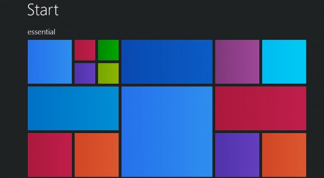
Windows 10 start screen

Windows 10 is a well-meaning effort by Microsoft to mollify Windows 8 haters and coax Windows 7 loyalists to upgrade — all while stubbornly sticking to its goal of a single OS for every possible platform. And by framing the problem that way, Microsoft has given itself a nearly impossible task.

To the company’s credit, each new build lurches closer to being usable, although with new bugs every time, it is difficult to evaluate how smooth the final release version will be. Best case: It may earn the grudging acceptance of Windows 7 users who refuse to move to Windows 8. And part of that acceptance will come not from sudden enthusiasm for a new way of interacting with the desktop, but from a desire to take advantage of the clear core benefits Windows 10 provides in performance, security, administration, and memory usage over Windows 7 and even Windows 8.

So why is it so hard to convince users to move to a brand-new, free, feature-packed, more efficient OS? Apple does it all the time. Simply put, because Microsoft didn’t build Windows 8 or Windows 10 for Windows users. It built them to further its own business strategy of using the power of the once-ubiquitous Windows platform to extend its dominance into the rapidly growing mobile space. The result is an OS whose features are now flipping and flopping with each new build — as Microsoft tries to fix problems of its own creation.

Imagine how good a desktop OS Windows 10 could have been

What if instead, after realizing what a terrible mistake Windows 8 was, Microsoft had made the truly brave decision to come clean and change its strategy? If Windows 10 had been designed from the beginning to be the best possible desktop OS, and the thousands of developer years spent trying to make it everything to everyone were instead spent providing services and applications for the mobile OS platforms people actually want? If in tandem Microsoft was willing to let go of its sub-3% market share in mobile, it could also have spent the cash it used to buy Nokia to build out its cross-platform services offerings instead. We could have had a really excellent desktop OS — worth paying for — and great integration with the leading mobile platforms.

Certainly Microsoft has woken up to providing competitive versions of its applications on Android and iOS. But imagine how much further along it would have been if it had put real work into the effort starting years ago. Perhaps we wouldn’t have to use third-party utilities to sync our information between Google and Outlook, for example. Or OneNote might have supported syncing on Android during the first several years it was available, instead of only recently. Pick any Microsoft desktop technology you access from your iOS or Android device and you can come up with a list of features that would make it much more useful.

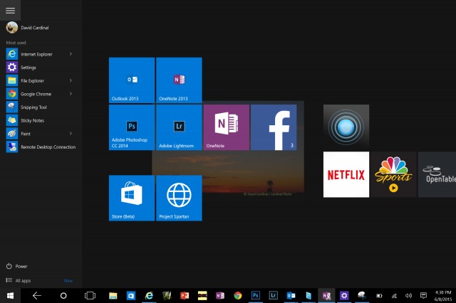
Windows 10's new Start menu is a mash up of the Windows 7 version and the Modern UI -- it has something for everone, but may not please anyone

It’s not like there isn’t anything to fix in Windows

Anyone who thinks Microsoft didn’t focus on desktop users as it evolved Windows 8 and 10 because its desktop OS has “no need for improvement” hasn’t spent enough time wrestling with the inscrutable hex error codes from Windows Update, or debugging driver version mismatches, or finding information they’re sure is somewhere on their disk. While Windows 10 isn’t final, judging by the builds so far, all of those problems are still there. Even support for high-resolution displays is still spotty. Windows 10 adds some new Zoom options, but there is still no serious scalable-font solution that works across the full range of possible displays.

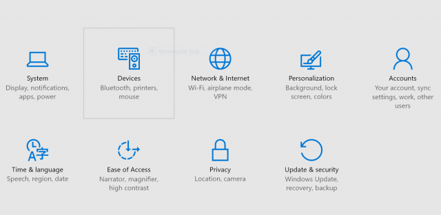
As a good example of how this alternate direction would have worked, let’s look at the Control Panel. No one doubts that it is an old, crufty system for managing a computer. A desktop-focused OS project would have overhauled it completely while preserving its functionality. Instead, Microsoft seems determined to replace it in bits and pieces with new “touch-friendly” settings that aren’t much more intuitive, and that become even more frustrating when you need to go back to the old system for pieces that are still missing. Windows 10 is supposed to address this problem, but we’re less than two months from shipment and Settings are still far from being either intuitive or finished.

Tablet mode and Continuum are also inventions seeking to solve a problem Microsoft has invented for itself. For the few of us who actually own and use a Surface Tablet mode, it’s sort of a good thing. (I love that I can both taken written notes and run Outlook on my SP3, but with the addition of desktop apps to Android, I’m not sure how many others will see the need to spend that kind of money for basic productivity.) It’s good because it is better than Windows 8, where often the touch keyboard wouldn’t pop up when needed, and icons could be hard to finger.

It’s still only sort of good, though, because it’s confusing and forces the user to have one more thing to think about. Somehow iPads and Android tablets seem to easily survive the addition of a keyboard without the need for an entire special OS mode. Like many of the other new features in Windows 10, it seems like a “throw it against the wall and hope it sticks” attempt to solve a user pain point — not a from-the-ground-up technology architected to support the broad range of devices that can now run Windows.

The new Settings UI is certainly prettier than the old Control Panel but is not as complete -- at least so far

Windows 10 internals are actually pretty impressive

There is a lot to like about Windows 10 — in addition to having the best kernel Windows has ever had. Edge (aka Spartan) is promising (although it too is only a prototype version, and certainly could have been shipped separately). Cortana might be useful, but is so limited and buggy in the current builds that it is hard to tell. If it doesn’t get sorted out by July, Microsoft risks taking yet another step backwards in desktop search functionality, which would be a shame. Virtual desktops are a nice feature, although hardly groundbreaking.

The included apps are certainly way ahead of the ones Microsoft shipped with Windows 8, but Microsoft has had many excellent desktop apps over the years — including the now-dead Windows Media Center, LiveWriter, and MovieMaker. It is the company’s own fault that it feels the need to start over time and again. On the tablet side, if Microsoft is serious about usability, it should be providing a better touch keyboard — one that includes swipe-through typing, for example. I also wish the company had finally fixed Windows Update. Mobile users won’t put up with the way it works now — they are spoiled by seamless OTAs from Apple and even many Android vendors.

Perhaps the ultimate warning sign about Windows 10 for me is that for many, its positioning is summed up as being “no worse than the six-year-old Windows 7, while adding support for tablets and phones.” That sounds pretty silly, but maybe not far from the truth. I run a Windows 7 desktop for some of my business-critical applications right next to a couple of Windows 8.1 machines and a couple of Windows 10 machines. I don’t really feel any less productive when I’m on the Windows 7 machine, and I can’t imagine that I’ll upgrade it to Windows 10 and risk something breaking.

Tablets are certainly a different story. I’ve already put Windows 10 on almost all my Windows tablets, and suspect most of the small number of Windows tablet users will also. Unfortunately for Microsoft, Windows tablets are a relatively small market, and may never become mainstream.

Laptops are the most interesting case. While each version of Windows adds new power management features, that may not be enough to get laptop users to upgrade. For example, Microsoft keeps changing the WiFi settings interface, and for many of us, the new version is lame compared to the more powerful one that preceded it. Engineering laptops still ship primarily with Windows 7, and I don’t see anything about Windows 10 changing that. Mainstream laptops will get dragged along onto Windows 10 because of the Microsoft marketing machine, but I don’t know how many current laptop users will bother to take advantage of the free upgrade. No doubt that is part of why Microsoft is inflicting its Windows 10 adware on the already confusing Windows Update process.

At this point the die is cast, and we’ll need to live with whatever we get on July 29th — or stay put and hope the little Get-Windows-10 nagware goes away.

دانلود موزیک ویدیوی آهنگ پوچ

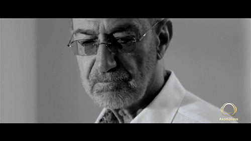
همونطور که وعده داده شده بود، موزیک ویدیوی آهنگ پوچ امشب از طریق سایت رادیو جوان منتشر شد. برای راحتی شما عزیزان این ویدیو با بالاترین کیفیت ممکن آپلود شده که می تونید دانلود کنید ولی در عین حال از شما تقاضا میشه برای بالا رفتن آمار بازدید این ویدیو در سایت رادیو جوان حتما از لینک اصلی ویدیو هم بازدید کنید.

برای دیدن نمونه تصویر، بر روی عکس کلیک کنید

دانلود موزیک ویدیوی آهنگ پوچ (کیفیت 1080)

(99.62 مگابایت)

دانلود از سایت رادیو جوان


دانلود نسخه ی صوتی آهنگ پوچ (کیفیت 320)

(8.47 مگابایت)

دانلود از سایت رادیو جوان