
Whitespace for dummies.
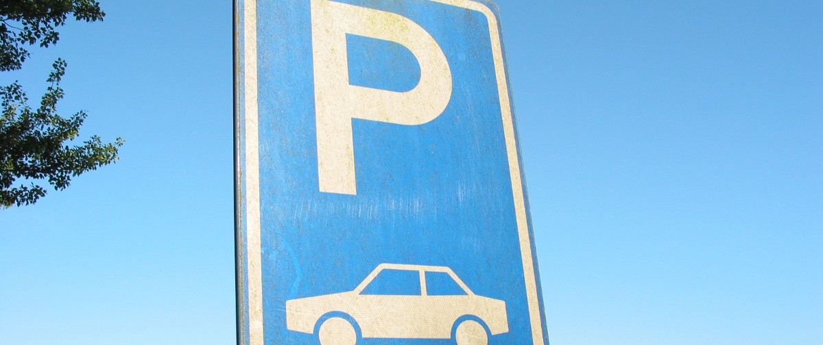
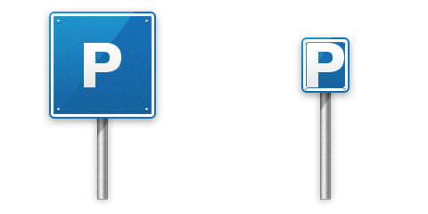
You see a parking sign like this every day as well as many other street signs. You probably do not even look at them with care, you just glance over them and you instantly know what they represent.
The design question that comes to mind: why is there so much unused space around the letter P? There are thousands of such signs around in your city, and they cost hefty money to make. Why bother with such a huge space around letter P that is not occupied with information? Why not cut down this sign to the border of letter P, and save lots of material, therefore save money?
The construct
This Parking sign is actually a construct of two major elements which when combined form a single piece conveying information.
- Letter P in the center,
- Lots of whitespace surrounding it.
The whitespace surrounding central piece of information is here to make sure this entire construct conveys the information. If you remove whitespace, the central information will blend with the background or other objects. In this case, if there was a white building in the background or a cloudy sky — the main information would be choked.
Whitespace is not some designery gimmick. It is not a trend in design. Whitespace is integral part of a construct helping the central piece to communicate a message.Removing whitespace corrodes the construct’s ability to work.
Love your whitespace.
This entry passed through the Full-Text RSS service - if this is your content and you're reading it on someone else's site, please read the FAQ at fivefilters.org/content-only/faq.php#publishers.