


#camping #fire #outdoors #1816 #remington

Aéroport de Prague (République Tchèque), 2015 © Stefane Ardenti

Photo by Makoto Saito
خانواده من دومین کتاب آکیل شارما درباره یک خانواده هندی است که به امید زندگی بهتر به آمریکا مهاجرت میکنند. اما با به کما رفتن یکی از فرزندانشان در اثر یک حادثه زندگی آنها تغییر میکند. راوی داستان، آجی هشت ساله است که هر روز با برادر بزرگترش در خیابانهای دهلی کریکت بازی میکرد و حالا او را روی تخت در بیهوشی میبیند.
گاهی که خیلی شاد و خوشحال هستید و هیچ دغدغهای خیالتان را ناآرام نمیکند، احتمالا ناگهان به فکرتان میرسد، شاید قرار است اتفاقی بیفتد… شاید این خوشی موقتی است، شاید قرار است اتفاق بدی بیفتد و شاید و شاید و …
آکیل شارما نویسنده هندی _ آمریکایی از این دسته آدمهاست. وقتی جایزه ادبی فولیو را برای کتاب «خانواده من» گرفت و از او پرسیدند چه 
احساسی داشتی؟ گفت اولین احساسی که سراغش آمده شرم بوده: «میخواستم گریه کنم، انگار کار بدی کردهام.»
اخیرا در مصاحبهای گفته دلیل امتناعش از «شادی و شاد بودن» نوعی انورکسیا است که تصمیم میگیری چیزی نخوری.
در این حالت تصمیم میگیری شاد نباشی: «من ترجیح میدهم در حالت گرسنگی باقی بمانم، چون آن وضعیت را میشناسم و برای من راحتتر است.»
کتاب اول او جایزه ادبی پن/فالکنر را برد و بیشتر داستانهای کوتاهش هم در مجله نیویورکر چاپ شدهاند.
«خانواده من» دومین کتاب او در باره یک خانواده هندی است که به آمریکا مهاجرت میکنند. دلیلش امید به زندگی بهتر است
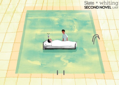
آجی، راوی داستان هشت سال دارد و هر روز با بیرجو برادرش که .چهار سال از او بزرگتر است در خیابانهای دهلی کریکت بازی میکند
پدر آنها یک سال است که به آمریکا رفته تا شرایط بردن خانواده را فراهم کند. تا این که برایشان بلیت میفرستد.
زندگی در آمریکا، زندگی در دنیای ناآشنایی است و تطبیق دادن شرایطش با زندگی که در هند داشتند، برای اعضای خانواده سخت است.
امید پدر به بیرجو است که دانشآموز موفقی است.
برادر بزرگتر موفق میشود که بورس تحصیلی یک دبیرستان معروف را بگیرد، اما پیش از شروع سال تحصیلی در شیرجهای به کف استخر، میخورد و دچار آسیب مغزی میشود و به کمایی طولانی مدت میرود.
با کمای او امیدهای خانواده و رویای زندگی آمریکایی هم به باد میرود.
داستان این کما و این که چطور از او مراقبت میکنند، از بین رفتن روابط خانوادگی و دعواهای پدر و مادر و حجم تنهایی و فشاری که به آجی هشت ساله وارد میشود، گاهی اوقات بیش از حد تصور است.
روابط آجی با پدر و مادرش و برادر در کما، خواننده را راحت نمیگذارد. پدر الکلی است، مادر دست به هر کاری میزند تا شاید پسرش به هوش آید و در شرایط کسی سراغ پسر کوچک خانواده نمیرود
آجی گاهی اوقات فکر میکند اگر برادرش بمیرد، او تنها فرزند خانواده میشود؛ گاهی خوشحال از این فکر و بیشتر مواقع از چنین فکری شرمسار. او با ‘خدا’ وارد مکالمه میشود. خدای او بیشتر شبیه سوپر من است تا کریشنا.
کتاب احساساتی نیست. نثر ساده، روان و راحتی دارد. آجی کوچک، راوی قصهای است که گاهی بیش از حد دردناک میشود. گاهی نیز خندهدار میشود اما خندیدن وسط آن همه تلخی احساس عذاب وجدان به خواننده میدهد.
There are many options available for utilizing HTML, CSS and JavaScript to create cross platform applications and I have covered many of them before. In this article I will look at NativeScript from Telerik that claims to be easier to create for cross platform apps than many existing options.
From their official documentation.
NativeScript enables developers to build native apps for iOS, Android and Windows Universal while sharing the application code across the platforms. When building the application UI, developers use our libraries, which abstract the differences between the native platforms.
In this tutorial we will create a simple app that searches for images on flickr and displays the results. We will make use of the flicker developer API to search images.
Source code from this tutorial is available on GitHub.
Install nodejs and then using the node package manager (npm), install native script.
npm install -g nativescript
After installing native script, create a new project called NativeApp.
tns create NativeApp
Navigate to the project directory and add the mobile development platform.
tns platform add android
Run the application on the android emulator.
tns run android --emulator


Inside the project folder there are 3 sub-folders: app, lib and platforms. The application source code resides in the app folder. Application code is written using JavaScript and the user interface designed using XML.
Inside the app folder is a file called main-page.xml which has the default user interface code. In main-view-model.js is the default model code and main-page.js defines the application logic. Finally app.js contains the code to start the application with the defined modules.
Let’s start by designing the app using XML. Open main-page.xml and look at the default code. Remove everything except the page tag. The Page tag has an attribute called loaded which executes the pageLoaded function once the app loads. The pageLoaded function is inside the main-page.js file.
This project will use a stack layout to design our app. There are a number of layouts offered by native script.
Inside the Page tag add the stack layout.
<StackLayout orientation="vertical">

</StackLayout>
Define the stack layout with a vertical orientation. Add a search text box and button inside the stack layout.
<TextField width="300px" hint="search keyword" />

<Button text="Search" height="50px" style="background-color:green;width:300px;border:none;font-size:20px;" />
Save changes and run the app. It should look something like the below.

Add an attribute called tap to the search button.
tap="signin"
Now, when the user taps the search button the signin function is called. Let’s define the signin function inside main-page.js.
exports.signin = function() {
  // Code would be here !
};
To use flickr’s developer APIs you will need a free account on flickr. Request an API key to make API requests.
In main-page.js define the API key.
var api_key = 'replacewithyourkey';
Calling the API will require the http module, so import the module into main-page.js.
var http = require("http");
Inside the signin function, and using the http module, now make the API call.
http.getJSON("https://api.flickr.com/services/rest/?method=flickr.photos.search&api_key=" + api_key + "&text=hello&format=json&nojsoncallback=1&per_page=5").then(function(r) {

    console.log(JSON.stringify(r));

}, function(e) {

    console.log(e);

});
The code above makes the API call with the search text hard coded for now, this will become dynamic later in the tutorial.
When running an app in the emulator you will need to run ‘adb logcat’ to check log messages.
Save changes and run the app on the emulator. Click the search button and the returned result from Flickr should be visible in terminal.
Next create the image url using the response returned and push the URL to the images array.
An observable array is required to create and detect changes to a collection of things. Bind this same observable array to the view so that the view updates whenever a change occurs.
To create the observable array, add these variable declarations to main-page.js :
var observableArray = require("data/observable-array");
var images = new observableArray.ObservableArray([]);
Based on the response returned from the API request, the next task is to create the flickr image URL. Detailed information can be found here about creating flickr URLs.
Next, we iterate through the returned data, create the image URLs and push to the images array. Add this code inside the signin function.
var imgUrl = '';

var photoList = r.photos.photo;

for (var i = 0; i < photoList.length; i++) {
    imgUrl = "https://farm" + photoList[i].farm + ".staticflickr.com/" + photoList[i].server + "/" + photoList[i].id + "_" + photoList[i].secret + ".jpg";

    images.push({
        img: imgUrl
    });

}
Once the data is in the images array, bind it to the UI. For displaying the data, create a ListView in main-page.xml, underneath the existing Button element.
<ListView>
    <ListView.itemTemplate>

        <Image stretch="fill" height="200px" />

    </ListView.itemTemplate>
</ListView>
Bind the images array to the list view and set the source of the image.
<ListView items="{{ images }}">
    <ListView.itemTemplate>

        <Image stretch="fill" height="200px" src="{{img}}" />

    </ListView.itemTemplate>
</ListView>
For the images array to be available across the view, set the images array in the observable module. Do this by importing an observable module and using it to create an observable object.
var observableModule = require("data/observable");
var pageData = new observableModule.Observable();
In the pageLoaded function, set the images array to the observable module and add the observable module to the page context.
function pageLoaded(args) {
    var page = args.object;
    pageData.set("images", images);
    page.bindingContext = pageData;
}
Using the same pageData observable object, the values from the search text box are readable. Modify the text field to add the text attribute.
<TextField width="300px" text="{{txtKeyword}}" hint="search keyword"/>
Inside the signin function, remove the hard coded hello search text and replace it with:
pageData.get('txtKeyword')
Save changes and run the app on the emulator. Click on the search button and images received from the Flickr API should be viewable. The request is for 5 images, so scrolling down should show all the images.

This tutorial demonstrates how to get started using NativeScript to create a simple mobile app. For detailed information about using NativeScript, I would recommend reading the official documentation.
Do you have had any mobile development experience using NativeScript? What’s your opinion about using NativeScript ? Let us know your thoughts, suggestions and corrections in the comments below.

//

expressions-of-nature

//

//
A lot has been said about different approaches to building websites. With the rise of responsive design as an industry standard, our approach to designing websites and interfaces has changed as well. In the past, the process was streamlined in stages (such as planning, wireframing, designing, slicing, developing, testing and publishing). Nowadays, with device landscape changed as well (mobile phones, tablets, laptops, desktops, and even watches) it’s a lot harder to keep everything consistent and functional across all devices.

We don’t have the resources to create a static design of one component (let’s say a header or a footer) across 10 different resolutions and viewports. Even if we design for the most popular devices, we’ll have to think about 4–5 screens with different aspect ratios, screen density, or screen estate in general. This is easier said than done.
Before we continue, I’d like to explain my design and planning process to better communicate my point of view. I start with a questionnaire for the client with different questions concerning the target audience of the project, strategies, expectations, and more. The better I understand the project and the client before I start, the more efficient I’ll be later on.
Next step is writing about the project to see if I understood the concept. This is helpful when working on projects in a niche where you don’t have much experience. Sort of like a functional specification, but less technical. It comes handy to define terminologies, keywords, and processes. Depending on the project complexity, I’ll probably do several scenarios and user flows. Usually the user onboarding flow, creation of content (if it’s that type of site), a checkout if it’s a webshop, or whatever is the specific kind of project I’m working on.
Next, I’ll start to produce a mood board, collection of things I like on other sites, colors or fonts we might use, icons, images and so on. If the client has a branding guideline, now would be a good time to explore it and talk about style.
You should do an interface inventory at this point. Brad Frost has a good article on that and a quote from his article really sums it up nicely:
An interface inventory is a comprehensive collection of the bits and pieces that make up your interface.
If you are doing a project from scratch, then you can start by writing all components and elements that your project will be built from. An unordered list will do just fine (definitely better than nothing).
Prototyping is the next big phase of every project, and I often start with pencil and paper. Building quick wireframes to talk about the layout and functionality is a good start. It doesn’t cost much time to build dozens of wireframes of different templates and components, but depending on the complexity of the prototype I might use apps like Balsamiq, Moqups, or even do a clickable HTML prototype.
If the prototype is a success, I’ll do some components or templates in a design program like Photoshop or Sketch. I pick one of the more complex pages that include different interface elements (e.g. navigation, header, footer, product listing). I’ll play with different styles, icons, and colors based on the predefined mood board. The purpose of visual design is to explore what a finished design might look like, keeping in mind that I’ll probably change it (for the better) when it’s built with HTML/CSS. Prototypes vary on the project, and I don’t always follow the same approach and might combine multiple techniques or programs into one project.
Designing in the browser is a term that became popular with the rise of responsive web design. In order to minimize hours spent in design programs like Photoshop, designers were urged to move the design phase into the browser by utilizing CSS. I’m quite fond of this approach, because it proved more efficient in my experience. In my case, the deliverable is HTML and CSS design, viewable and usable in the browser. To learn why, keep reading.
By focusing on the HTML mockup and testing design ideas in–browser with CSS, we save time we might usually spend in Photoshop or Sketch doing static mockups. For best results, I recommend you equip yourself with a good code editor and browser refresh method so you can see changes in real time as you type them. I rely on Sublime Text and Codekit combo, although there are other options available as well depending on your preference or operating system.

HTML and CSS, structured as they are, forces us to think about patterns and keep us in check. It’s easier to think about modularity when you are building HTML components that can easily be copied, duplicated and filled with dynamic data while keeping the same structure. If you want to create a specific modification, you have to explicitly target that element or add another CSS class. When you style headings, they will be consistent across the site unless they are overridden. Same goes for other elements. This type of thinking forces you to standardize, group common elements together, reuse already styled elements as much possible, and most importantly keep everything modular.
With a single CSS declaration, you can change padding on buttons for better touch targets and test directly on a mobile phone, tablet, and desktop. This can’t be easily done in Photoshop or Sketch, because other elements are not aware of each other in layout and you would have to reorganize objects each time you change something in size. Want to try out a different header color scheme? Several lines of code and changes are visible on all HTML templates on all your devices and screens. That kind of flexibility for exploration can’t be emulated easily when you have 20 static mockups. Granted, you could use smart objects in Photoshop, or Symbols in Sketch for components but it’s not as versatile as CSS.
The Internet would have been very different if web browsers were just PSD viewers.
In this phase you will have to make several technical decisions. The weight of these decisions will influence the quality of the design. Some of the questions you will need to answer:
Choosing fonts for your project can be challenging. There are many possibilities and as much constraints that you become aware when you need to choose font delivery approach. Since the design will be used in the browser there is no better place to try out fonts. Font readability can vary based on the size, weight, colors, rendering — so by trying out fonts directly in the browser you are making sure that desired expectations are met.
There are many tools online that you can use for testing fonts and trying out combinations. My personal favorites are Typetester and Typecast, where you can test different fonts from various services and foundries. If I’m working with a specific font subscription service like Typekit or Fonts.com, I generate fonts and test on my own templates directly. Generating a Typekit package with new fonts is really simple and fast, and you get to see how the font will affect performance of your page as well.
If you decide to draw icons by yourself you will need to define size, grid, and style. I do all my icons in Illustrator where every artboard represents one icon. You can easily export icons from Illustrator as SVG or PNG, which can later be turned into an icon font with services like Icomoon. I would suggest to go with vector icons (SVG) if possible, because vectors are resolution independent so you won’t have to worry how they display on high definition screens — they will be sharp.
There are a lot of premium icon packs with a variety of icon styles, so if you need diversity that is also a viable option. Unless you did an icon inventory from the start and know exactly what icons you’ll use in the project, leave room for the option to easily add new icons.
Even if we design in the browser, with dozens of templates and components we might lose track of where something is used and in what fashion. That’s why I suggest to build a style guide of all components as a central repository. Specific page templates will be built from this style guide by combining components and modules into whole pages. Components might be form elements, pagination, product listing, image gallery, modal windows, etc. and are used as building blocks for required templates. Keeping everything in one place is really handy when you want to test a specific component.

I would suggest to separate styling of these components into separate files. For example, pagination styling will be in in _pagination.scss, form elements in _form.scss, and all these files will be included into a single SCSS file with other files (variables, mixing, etc.). Although your style.scss might be composed of dozens of “small files”, I hope you’ll agree with me that it’s easier to keep track of changes (whether you are using source control or not) when several people are working on the same project if everything is separated into smaller chunks. It’s important that you maintain your style guide even after project is in production, since you need to be able to keep track of every component on the site - no exceptions.
From the development standpoint, there are many approaches to writing modular CSS. Most known are SMACSS, BEM, and OOCSS — I encourage you to read about these techniques because there is a lot to learn, even if you end up developing your own approach. By now you should have a nice collection of components and pages which will enable you to easily build new pages or scenarios. Just copy and paste (or include, if you are using a build system) elements from the style guide and rearrange them as needed. Since everything is modular, you don’t have to worry about design and code consistency; but don’t forget that if you change something semantically, you’ll need to update the style guide with changes (or a new component). To keep everything organized, I suggest you use some sort of templating approach to building pages such as a Gulp/Grunt build system or even good old PHP might do the trick.
Now you have a central repository of components, pages build from those components, and every piece documented — from colors, icons, and fonts to components that are used on your project. Here comes the fun part. From this point on, you probably won’t open your design tool, and most of the “design” will be done directly in the code. You are not sure how a specific change will impact different use–cases? Preview your design simultaneously on different devices and browsers to see how that heading or button change will impact the design. Not sure about how font additional weights will impact performance if you are including custom fonts? You can test your work–in–progress project performance using services like WebPageTest, and make informed decisions on actual results. You can’t do that in Photoshop or Sketch. That’s why I would choose HTML and CSS over these apps every time when it comes to refinement and adjustments of the original design mockup.
If you really care about design, you should make sure that every part of it is perfect. Something can look amazing in a static design mockup, but it might look terrible when implemented. Let’s test and fix these use–cases in the environment where everyone will see and use them - in the browser.
member since September 1, 2014
Windows 10 is a well-meaning effort by Microsoft to mollify Windows 8 haters and coax Windows 7 loyalists to upgrade — all while stubbornly sticking to its goal of a single OS for every possible platform. And by framing the problem that way, Microsoft has given itself a nearly impossible task.
To the company’s credit, each new build lurches closer to being usable, although with new bugs every time, it is difficult to evaluate how smooth the final release version will be. Best case: It may earn the grudging acceptance of Windows 7 users who refuse to move to Windows 8. And part of that acceptance will come not from sudden enthusiasm for a new way of interacting with the desktop, but from a desire to take advantage of the clear core benefits Windows 10 provides in performance, security, administration, and memory usage over Windows 7 and even Windows 8.
So why is it so hard to convince users to move to a brand-new, free, feature-packed, more efficient OS? Apple does it all the time. Simply put, because Microsoft didn’t build Windows 8 or Windows 10 for Windows users. It built them to further its own business strategy of using the power of the once-ubiquitous Windows platform to extend its dominance into the rapidly growing mobile space. The result is an OS whose features are now flipping and flopping with each new build — as Microsoft tries to fix problems of its own creation.
What if instead, after realizing what a terrible mistake Windows 8 was, Microsoft had made the truly brave decision to come clean and change its strategy? If Windows 10 had been designed from the beginning to be the best possible desktop OS, and the thousands of developer years spent trying to make it everything to everyone were instead spent providing services and applications for the mobile OS platforms people actually want? If in tandem Microsoft was willing to let go of its sub-3% market share in mobile, it could also have spent the cash it used to buy Nokia to build out its cross-platform services offerings instead. We could have had a really excellent desktop OS — worth paying for — and great integration with the leading mobile platforms.
Certainly Microsoft has woken up to providing competitive versions of its applications on Android and iOS. But imagine how much further along it would have been if it had put real work into the effort starting years ago. Perhaps we wouldn’t have to use third-party utilities to sync our information between Google and Outlook, for example. Or OneNote might have supported syncing on Android during the first several years it was available, instead of only recently. Pick any Microsoft desktop technology you access from your iOS or Android device and you can come up with a list of features that would make it much more useful.

Anyone who thinks Microsoft didn’t focus on desktop users as it evolved Windows 8 and 10 because its desktop OS has “no need for improvement” hasn’t spent enough time wrestling with the inscrutable hex error codes from Windows Update, or debugging driver version mismatches, or finding information they’re sure is somewhere on their disk. While Windows 10 isn’t final, judging by the builds so far, all of those problems are still there. Even support for high-resolution displays is still spotty. Windows 10 adds some new Zoom options, but there is still no serious scalable-font solution that works across the full range of possible displays.
As a good example of how this alternate direction would have worked, let’s look at the Control Panel. No one doubts that it is an old, crufty system for managing a computer. A desktop-focused OS project would have overhauled it completely while preserving its functionality. Instead, Microsoft seems determined to replace it in bits and pieces with new “touch-friendly” settings that aren’t much more intuitive, and that become even more frustrating when you need to go back to the old system for pieces that are still missing. Windows 10 is supposed to address this problem, but we’re less than two months from shipment and Settings are still far from being either intuitive or finished.
Tablet mode and Continuum are also inventions seeking to solve a problem Microsoft has invented for itself. For the few of us who actually own and use a Surface Tablet mode, it’s sort of a good thing. (I love that I can both taken written notes and run Outlook on my SP3, but with the addition of desktop apps to Android, I’m not sure how many others will see the need to spend that kind of money for basic productivity.) It’s good because it is better than Windows 8, where often the touch keyboard wouldn’t pop up when needed, and icons could be hard to finger.
It’s still only sort of good, though, because it’s confusing and forces the user to have one more thing to think about. Somehow iPads and Android tablets seem to easily survive the addition of a keyboard without the need for an entire special OS mode. Like many of the other new features in Windows 10, it seems like a “throw it against the wall and hope it sticks” attempt to solve a user pain point — not a from-the-ground-up technology architected to support the broad range of devices that can now run Windows.

There is a lot to like about Windows 10 — in addition to having the best kernel Windows has ever had. Edge (aka Spartan) is promising (although it too is only a prototype version, and certainly could have been shipped separately). Cortana might be useful, but is so limited and buggy in the current builds that it is hard to tell. If it doesn’t get sorted out by July, Microsoft risks taking yet another step backwards in desktop search functionality, which would be a shame. Virtual desktops are a nice feature, although hardly groundbreaking.
The included apps are certainly way ahead of the ones Microsoft shipped with Windows 8, but Microsoft has had many excellent desktop apps over the years — including the now-dead Windows Media Center, LiveWriter, and MovieMaker. It is the company’s own fault that it feels the need to start over time and again. On the tablet side, if Microsoft is serious about usability, it should be providing a better touch keyboard — one that includes swipe-through typing, for example. I also wish the company had finally fixed Windows Update. Mobile users won’t put up with the way it works now — they are spoiled by seamless OTAs from Apple and even many Android vendors.
Perhaps the ultimate warning sign about Windows 10 for me is that for many, its positioning is summed up as being “no worse than the six-year-old Windows 7, while adding support for tablets and phones.” That sounds pretty silly, but maybe not far from the truth. I run a Windows 7 desktop for some of my business-critical applications right next to a couple of Windows 8.1 machines and a couple of Windows 10 machines. I don’t really feel any less productive when I’m on the Windows 7 machine, and I can’t imagine that I’ll upgrade it to Windows 10 and risk something breaking.
Tablets are certainly a different story. I’ve already put Windows 10 on almost all my Windows tablets, and suspect most of the small number of Windows tablet users will also. Unfortunately for Microsoft, Windows tablets are a relatively small market, and may never become mainstream.
Laptops are the most interesting case. While each version of Windows adds new power management features, that may not be enough to get laptop users to upgrade. For example, Microsoft keeps changing the WiFi settings interface, and for many of us, the new version is lame compared to the more powerful one that preceded it. Engineering laptops still ship primarily with Windows 7, and I don’t see anything about Windows 10 changing that. Mainstream laptops will get dragged along onto Windows 10 because of the Microsoft marketing machine, but I don’t know how many current laptop users will bother to take advantage of the free upgrade. No doubt that is part of why Microsoft is inflicting its Windows 10 adware on the already confusing Windows Update process.
At this point the die is cast, and we’ll need to live with whatever we get on July 29th — or stay put and hope the little Get-Windows-10 nagware goes away.

deltalight - Google zoeken