

There are plenty of valuable resources (articles, tutorials, and online tools) discussing the flexbox layout module. Flexbox has gained so much traction that more and more grids and frameworks are supporting this powerful layout feature.
In this article, we’ll examine how 3 tools are incorporating flexbox-based grids and I’ll show you some demos that will illustrate the features.
Note: This article expects that you have some knowledge of flexbox.
Flexbox Grid is a grid system built on top of flexbox. If you’re familiar with Bootstrap, this grid uses the same predefined grid classes and media query breakpoints. The following table summarizes how the grid works:
| Screens | Viewport Size | Container Width | Class Prefix |
|---|---|---|---|
| Extra small screens | <30em (768px) | auto | .col-xs-* |
| Small screens | ≥48em (768px) | 46rem (736px) | .col-sm-* |
| Medium screens | ≥62em (992px) | 61rem (976px) | .col-md-* |
| Large screens | ≥75em (1200px) | 71rem (1136px) | .col-lg-* |
To get started with Flexbox Grid, you have to install and include the required CSS file (i.e. flexboxgrid.css) in your projects. More information about this process is available on the project’s GitHub page.
Let’s now create a responsive navigation menu based on this grid. Here’s what we’re going to build:

First, we define the ul element as a flex container by assigning the row class to it. Then we use the col-xs-2 class to specify the width of the flex items. This class ensures that the list items will have a maximum width equal to 16.667% for all devices. Finally, we horizontally and vertically center our items by adding the center-xs and middle-xs classes to the flex wrapper.
Below is the required HTML:
<nav>
  <ul class="row center-xs middle-xs">
    <li class="col-xs-2">
      <a href="#">Home</a>
    </li>
    <li class="col-xs-2">
      <a href="#">About</a>
    </li>
    <!-- more list items here... -->
  </ul>
</nav>
And here are some CSS styles to enhance the appearance of our menu:
.row {
  height: 80px;
}

ul a:before  {
  font-family: FontAwesome;
  font-size: 22px;
}

ul li:nth-child(1) a:before {
  content: 'f015';
}

@media screen and (max-width: 800px) {
  ul a {
    font-size: 0;
  }

  ul a:before {
    font-size: 32px;
  }
}
Note: To keep things simple, I’ve only included some of the rules from the corresponding CSS file.
See the Pen A flexible menu based on the Flexbox Grid framework. by SitePoint (@SitePoint) on CodePen.
At this point we have a new requirement. We have to add our logo to the main menu. The following screenshot shows what we want to create:

To make that work, we’ll add a bit of extra markup.
Here’s the new version of our HTML:
<div class="row center-xs middle-xs">
  <div class="col-sm-2 col-xs-4">
    <h1>
      <a href="#">My Logo</a>
    </h1>
  </div>
  <div class="col-sm-8 col-sm-offset-2 col-xs-12">
    <nav>
      <ul>
        <li class="col-xs">
          <a href="#">Home</a>
        </li>
        <!-- more list items here... -->
      </ul>
    </nav>
  </div>
</div><!-- end of .row ... -->
Let’s explain the code above:
div element as the outer flex wrapper of our logo and menu. We assign different grid classes to the flex items depending on the viewport size. For example, on small devices and up (≥768px) the logo will have a maximum width equal to 16.667%, while the menu will occupy 66.667% of the parent’s width. 16.667% to the right by giving it a class of col-sm-offset-2.col-xs class we set on our list items. If you remember the previous example, we had used the col-xs-2 class. In this case though, we apply the col-xs class because we give items the option to grow and cover the entire parent’s width.See the Pen A flexible menu, with logo, based on the Flexbox Grid framework. by SitePoint (@SitePoint) on CodePen.
UIkit is a modern front-end framework similar to Bootstrap and Foundation. It comes with a number of different components, which you might find useful depending on your needs. For the purposes of this article, we’ll combine the Flex, Slideshow, and Dotnav components, so as to build a responsive slideshow.
As usual, to use this plugin in your projects, make sure to download and install the required files. Also keep in mind that the additional components aren’t included in the core framework, so if you want to use any of those components, you have to add them to your projects as well.
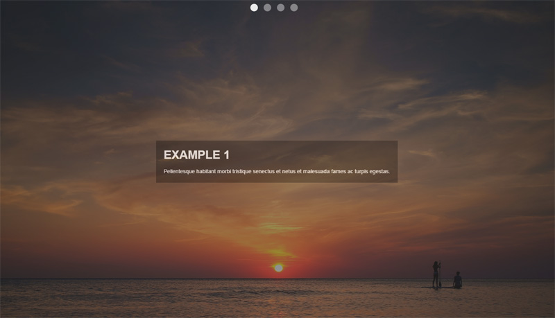
The image below shows what our slideshow will look like:
To build it, we’ll take advantage of the basic code for the Slideshow component that UIkit provides us:
<div data-uk-slideshow>
  <ul class="uk-slideshow uk-slideshow-fullscreen">
    <li>
      <img src="https://download.unsplash.com/photo-1414446483597-8d8f792bfe39">
      <div class="uk-overlay-panel uk-overlay-background uk-overlay-fade">
        <div class="caption">
          <h3>Example 1</h3>
          <!-- more content here -->
        </div>
      </div>
    </li>
    <!-- more list items here --->
  </ul><!-- end of slideshows list --->
  <ul class="uk-dotnav uk-dotnav-contrast uk-position-top uk-flex-center">
    <li data-uk-slideshow-item="0">
      <a href="#"></a>
    </li>
    <li data-uk-slideshow-item="1">
      <a href="#"></a>
    </li>
    <li data-uk-slideshow-item="2">
      <a href="#"></a>
    </li>
    <li data-uk-slideshow-item="3">
      <a href="#"></a>
    </li>
  </ul><!-- end of dotnavs list --->
</div>
Notice the uk-flex-center class that we applied to the second ul element. This horizontally centers the slideshow navigation. In addition, we can modify the flex behavior by removing this class and adding another one (e.g. the uk-flex-column class).
See the Pen UIkit slideshow with flexbox by SitePoint (@SitePoint) on CodePen.
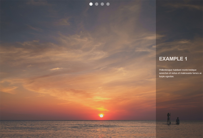
At this point, we’ll use the power of flexbox to modify the previous version of our slideshow. In fact, we’ll change the position of the div.caption element. As you can see in the screenshot below, the goal is to horizontally and vertically center it:
To achieve this, all we have to do is assign some additional helper classes to the immediate parent (flex wrapper) of the div.caption element (flex item). Here’s the HTML that we have to update:
<div class="uk-overlay-panel uk-overlay-background uk-overlay-fade
            uk-flex uk-flex-center uk-flex-middle">
  <div class="caption">
    <h3>UIkit Framework</h3>
    <!-- more content here -->
  </div>
</div>
See the Pen UIkit slideshow with flexbox and alternate caption layout. by SitePoint (@SitePoint) on CodePen.
Brian Franco has developed a set of useful Sass mixins that we can use to build flexible layouts. In order to work with them, you have to grab a copy of the required SCSS file (the flexbox.scss partial) from the GitHub repo then incorporate it in your SCSS project.
At this point, let’s see those mixins in action by trying to replicate the layout of the following screenshot:
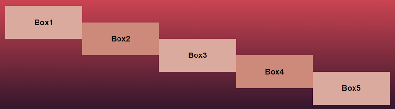
To do this, we start by setting the section element as our flex container and we lay out the flex items vertically (as columns). Next, each of the columns receives a different value for the justify-content property. The last step is to take advantage of CSS pseudo-elements in order to create some extra “flex items”.
Here’s our HTML:
<section>
  <div class="box box1" data-content="Box2">
    <h3>Box1</h3>
  </div>
  <div class="box box2" data-content="Box4">
    <h3>Box3</h3>
  </div>
  <div class="box box3">
    <h3>Box5</h3>
  </div>
</section>
And the SCSS styles:
section {
  @include flexbox;
  @include flex-direction(column);

  .box {
    width: 20%;
    height: 100px;
    position: relative;

    &:after {
      display: block;
      position: absolute;
      top: 50%;
      right: -100%;
      width: 100%;
      height: 100%;
    }
  }

  .box1 {
    @include align-self(flex-start);

    &:after {
      content: attr(data-content);
    }
  }

  .box2 {
    @include align-self(center);

    &:after {
      content: attr(data-content);
    }
  }

  .box3 {
    @include align-self(flex-end);
  }

  @media screen and (max-width: 500px) {
    .box {
      width: 100%;
    }

    &:after {
      top: 100%;
      right: 0;
    }
  }

}
Note: To keep things simple, I’ve only included some of the rules from the corresponding SCSS file and I’ve omitted the compiled CSS.
See the Pen A flexbox layout with Brian Franco’s sass-flex-mixin by SitePoint (@SitePoint) on CodePen.
Beyond the three tools that we analyzed above, there are other flexbox-based grids and frameworks, some of which are shown below:
I hope this summary has helped you see how some modern tools are using flexbox. As a next step, I recommend experimenting with the following exercises:
If you’ve used any modern frameworks that incorporate flexbox, let us know in the comments.
بنفشه
شاعر : هوشنگ زاهدی
باران که چنین خاکِ چمن می شویَد
وز بارشِ آن بنفشه ای می روید
روزی به سرِ خاکِ تو ومن بارد
تا کس ز بنفشۀ تو و من بوید

Kate Moss for W by Ryan McGinley


Cecil Touchon
Photo: Michael Coghlan
When you start a design project – what do you aim for? What principles do you go by? I’m quite curious to know what goes on in your head.
Over the last few weeks, I’ve seen dozens of new business owners launch their website. This was in an online business course that I was part of. Some of these sites were done by the owners themselves, and a larger number done by professionals who charged a bomb.
However, what stood out was the common thread running through those sites. These businesses were all focused on, or at least trying to focus on, their end user. They wanted to please, to provide value, and ultimately seduce potential customers. They put in the research and came up with visually appealing websites, which they thought would provide a great user experience.
Then they waited with bated breath for the subscribers, and the sales.
And kept waiting.
While their marketing efforts kept the traffic coming in, viewers were just not signing up, or buying. It was heart breaking.
No matter how beautiful your design, or how great your user experience, if visitors don’t sign up, or buy, you might as well not have a website at all. A site that dies with happy users but no revenue, still dies.
Of course, if you’re lavishly funded by VCs and not required to turn a profit in the short term, you can afford to focus entirely on UX and leave revenue to work itself out later (shout out to Twitter).
But the reality is that most of us don’t have that luxury.
What if, instead of relying on a digital marketer to come in later and fix this situation, we started weaving in the elements of conversions into our designs? Along with the visual appeal and user experience, perhaps it’s time designers shifted focus – or at least became conscious of – Conversion Centric Design (CCD).
With Conversion Centric Design the focus is on creating experiences that drive visitors towards a specific business goal. Persuasive design and psychology principles are used to actively drive visitors into the sales funnel – rather than just creating a pretty site and hoping people sign up.
Conversion Centric Design has so far, been the domain of internet marketers, looking to increase conversions on landing pages and sales pages. But there’s no reason the same principles can’t be used while designing the entire website.
Let me walk you through some of the design elements of conversion centric design that you can easily incorporate in your designs. And while we’re at it, let’s take a look at some examples as well.
Encapsulation is a technique where you create a frame around a feature or focus area, to ‘hijack’ your visitors gaze. By doing this, you can subtly ensure that certain pieces of information are highlighted and get the attention they deserve. Encapsulation can be done using images, graphics, or just simple frames around the element you want to highlight.
It works particularly well with Call-To-Actions of all types, as well as testimonials, or data points that you want to share on your site.
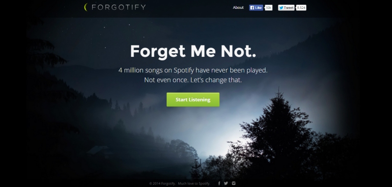
For example, take a look at Forgotify’s home page. The simple play of light in the background frames their CTA in an almost mesmerizing manner.
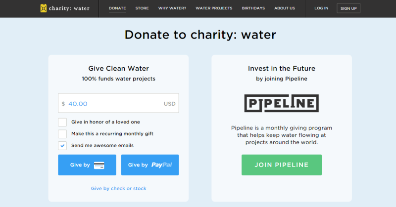
CharityWater also uses encapsulation in a more subtle way. The slightly paler background color on their CTA versus the rest of the page, helps frame the CTA clearly and draw visitors to it.
Color and contrast have long been used in design aesthetics to evoke certain emotions. This is about using color contrast to subtly nudge and persuade viewers into taking a desired action.
That action could be anything – signing up, buying, or even just clicking through to the next page. Notice how Forgotify’s simple “Start Listening” in green pops out against the dark background. You just have to click it.
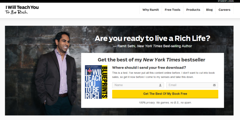
As another example, take a look at the IWT page – there’s no chance visitors can miss that bright yellow CTA.
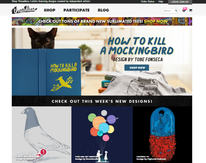
In contrast, take Threadless. They just got the color contrast part all wrong! Multiple blue images and graphics completely drown out the small blue “Shop Now” button. Can you find it in the image? Instead, the colorful planets and the red half of the capsule jostle for the viewers attention.
A smart move is using buttons or contrasts that also generate the desired psychological impact.
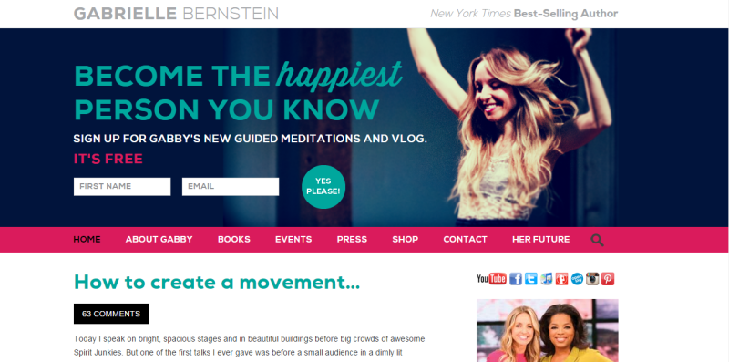
Directional Cues are visual indicators, subtle or otherwise, that you use to draw attention to your focal point. Subtle inclusions include using a scenery that has a salient pointer or picture of a person looking at the desired focal point. Using arrows, is a clear, unambiguous way to draw attention. In the screenshot below, follow Gabrielle Bernstein's line of sight – it leads directly to the optin on her homepage. It’s the perfect header image – leading directly to sign ups for her newsletter.
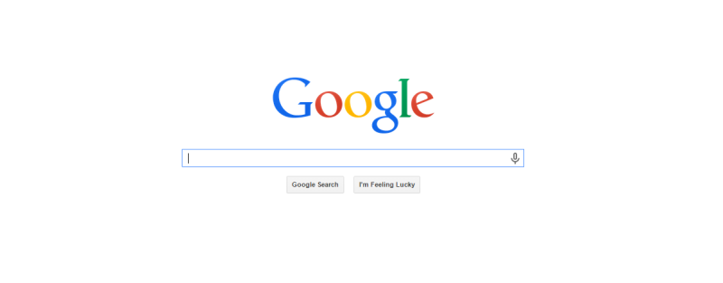
Remember the trend when everyone tried to use up every possible pixel of the page’s real estate? Google’s simple home page was considered revolutionary in those days. They wanted their home page to do just one thing – help people search the internet.
Just one box. Nothing else on the page. No menu. No About page. Nothing else. That simple text box right in the middle of a blank page has helped Google make billions. Do I need to say any more about the power of white spaces in conversion design?
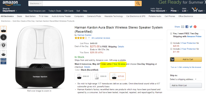
Decision Theory shows people are more averse to losing something or missing out on it, as compared to acquiring something. It’s called Loss Aversion and has been widely used to prompt visitors to signing up or purchasing something from the website. Amazon uses this technique extensively creating a sense of urgency with their “Want it tomorrow? Order within X hours, Y minutes”.
Back on the IWT website, Ramit Sethi doesn't use a definite timeline. Instead he creates that sense of urgency by saying "get it now before I change my mind and take this down". Great example of how simple copy writing can be used to create scarcity.
Another widely used conversion technique is the “Try Before You Buy”. Street vendors and shops have been using this technique for centuries, but it’s only now catching up in the online world.
As humans, we hate uncertainty – it's in our DNA. Especially the uncertainty that comes from impersonal online interactions. When buying a book, or shoes, or clothes or software online, the customer can’t pick it up, try it out, feel it, smell it. Offering visitors a free sampling of your software, preview of your book, or a free consultation session serves to give them a taste of what to expect.
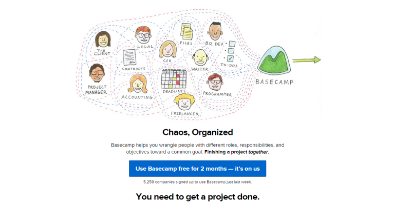
Basecamp has one of the most generous trial offers – for a whole two months. Take a look back at the screenshot of the IWT page – Ramit Sethi offers a free download of the best content from his bestselling book. This gives visitors a safe, risk-free, way to experience the product/book with ample time to make a decision to buy the product.
People like to belong. They like to be part of a group and will often conform to group decisions and choices, even if they there is an element of doubt.
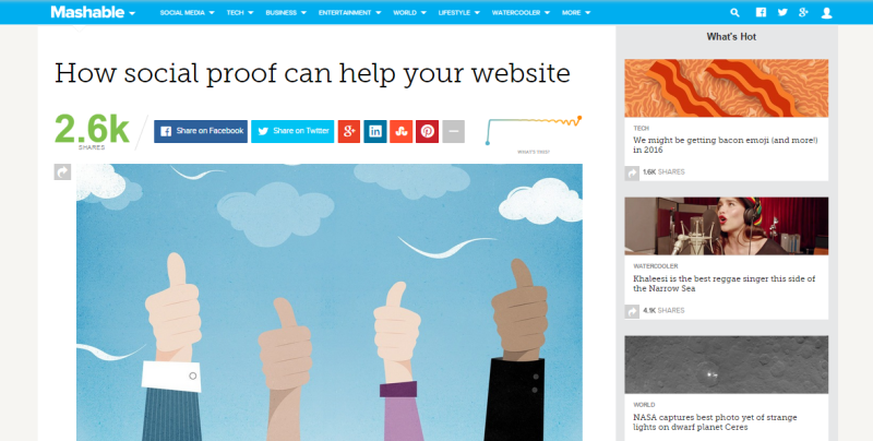
Social proof can be in many forms – endorsements, case studies, reviews, user generated content and even just numbers (of how many people like/use/shared) your content. That’s why many websites today display testimonials and shares up front. Mashable for example, goes a step further to display the ‘velocity’ of their shares – the rate at which people around the globe are sharing their content.
Of course, make sure you’re using it right. Highlighting that you have 0 shares, or using the wrong kind of testimonials, can actually backfire.
I hope this short walk through the design and psychology elements of conversion centric design helped pique your interest. You can get a better understanding of conversion centric design with this free eBook from Unbounce. It all comes down to focusing your design efforts toward specific business results,instead of just putting together a visually appealing site.
Would love to hear your take on this. Do you incorporate conversion principles into their design process? Or do you believe marketing is best left to the internet marketers?
Share your thoughts with us in the comments below.
دیدن روی تو در خویش ز من خواب گرفت / آه از آیینه که تصویر تو را قاب گرفت
خواستم نوح شوم، موج غمت غرقم کرد / کشتیام را شب طوفانی گرداب گرفت
در قنوتم ز خدا «عقل» طلب میکردم / «عشق» اما خبر از گوشهی محراب گرفت
نتوانست فراموش کند مستی را / هر که از دست تو یک قطره می ناب گرفت
کی به انداختن سنگ پیاپی در آب / ماه را میشود از حافظهی آب گرفت
شعر از: فاضل نظری


هفته نامه طراحی وب فارسی هر پنجشنبه بهترین لینکهای فارسی حوزه طراحی وب رو جمعآوری و منتشر می کنه. یک کار خوب که یک نقطه شروع خوب میسازه برای هر کسی که علاقمند به طراحی وب است. جالبیش هم اینه که کل پروژه روی گیت هاب است. اطلاعات بیشتر در مورد هفته نامه طراحی وب فارسی
بنیاد دانش آزاد هم چیزیه که باید در موردش بدونیم و اگر به حوزه مون می خوره، باهاش همکاری کنیم. توی ویکی بنیاد دانش آزاد در مورد کارهاشون بیشتر توضیح داده شده و چند سالی هست که مشغولن و محتوای بسیار خوبی هم دارن.
اگر دنبال اخبار و رویدادهای تکنولوژی هوشمند و پوشیدنی و سیستمعاملهای موبایل و فناوریهای جدید هستین یک سایت جدید هم براتون دارم؛ تکنولوژی + تاچ = تکنوتاچ. از اسمشون معلومه که ایدههای جالبی دارن!
« ایـنـکـو » جایست که آدمها با هم لحظاتشان را به اشتراک میگذارند زیرا ما مدعی هستیم که میتوانیم لحظات ناب را با هم شریک شویم. به طور مثال من تا به حال قلعهالموت نرفتم و خوشحال میشوم قبل از سفر، نظرات کاربران نزدیک آن منطقه را بدانم؛ یا همایشی که امروز در آن حضور دارم، چه صحبتی در جریان است؟ حالا میتوانیم اطلاعات مورد نظرمان را به شکلی متفاوت بدست آوریم، به طوری که لازم نباشد متنی را در پستها جستجو کنیم، زیرا ممکن است زبان اسپانیایی بلد نباشیم، ولی دوست داریم بدانیم آیا کسی در اسپانیا تصاویری از مناظر شهر را به اشتراک گذاشته؟ در « ایـنـکـو » این امکان را فراهم آوردیم که با انتخاب موقعیتی در نقشه، پستهای آن نزدیکی نمایش داده شود و البته برای استفاده از « ایـنـکـو » هیچ اجباری در ارسال مکان جغرافیایی شما نیست.
سایت خبری گود نیوز هم حدود یکسالی هست که فعاله و حالا نسخه دوم آزمایشیاش مجهز شده به یک ریدر و خبرخوان عمومی و یه سری خدمات جانبی هم مثل فوتبال و ارز و مسکوکات و آب و هوا. از برخی خدماتش می تونین استفاده کنین و بخشی از قسمتها هم دعوت نامه ای است که امیدوارم اگر می خواینش، گرفتنش سخت نباشه.
و …
شرکت کامپلیتل می گه دنبال آدمهایی است که بخوان چالشهای جدید حل کنن، بتونن با گوگل گلیمشون رو از آب بیرون بکشن و دوست دارن تو تیم فعال پروژههای اپلیکیشن و سرویسهای موبایلی باشن. کامپلیتلکام دنبال متخصص UX، UI و چند توسعه دهنده که تخصصشون جاوا و اندروید باشه میگرده، اگر در مورد نحوه کار کردن سرور و سرویس های مختلف لینوکسی اطلاعاتی داشته باشید خیلی بهتره. رزومه خودتون رو به job@completelecom.com ارسال کنید.
سینرژی یعنی اضافه شدن دو چیز و تولید محصولی بزرگتر از جمع اون دو چیز. سینرژی یعنی اگر من رسانه ای دارم و مخاطبی، اونو با شما به اشتراک بذارم تا همه نفع ببرن. اگر مطلبی دارین که فکر می کنین برای معرفی در آخرین دوشنبه تیرماه مناسبه، برام بفرستین تا اینترنت بهتری برای فارسیزبانها بسازیم.